Coastal Bathroom Reveals - How we Split One Bathroom in Two
We’re back at my North Wales Coastal Home project again! It’s been quite a while since these bathrooms were finished and I’ve finally got round to writing the final reveal post. If you’ve been following me for a while, you’ll know that this house was previously owned by my lovely nanan, who lived in it from 1954 until she passed away in 2018. It’s now owned by my mum and dad. You can read a bit about the background here.
I’ll be showing you how we created a new bathroom by separating the existing bathroom in two, and also how we created a coastal feel to tie in with the rest of the house.
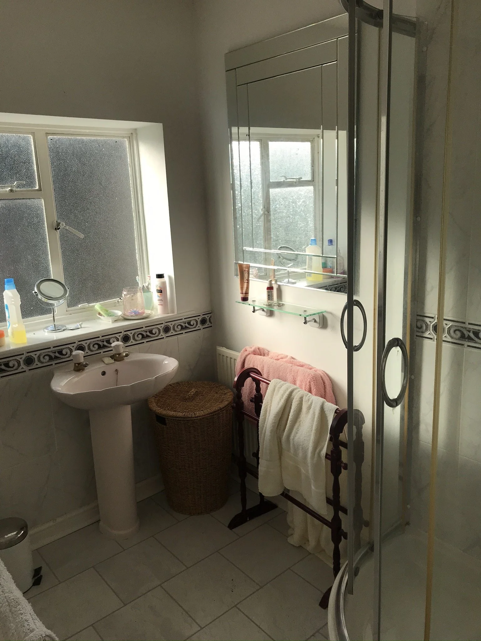
Before
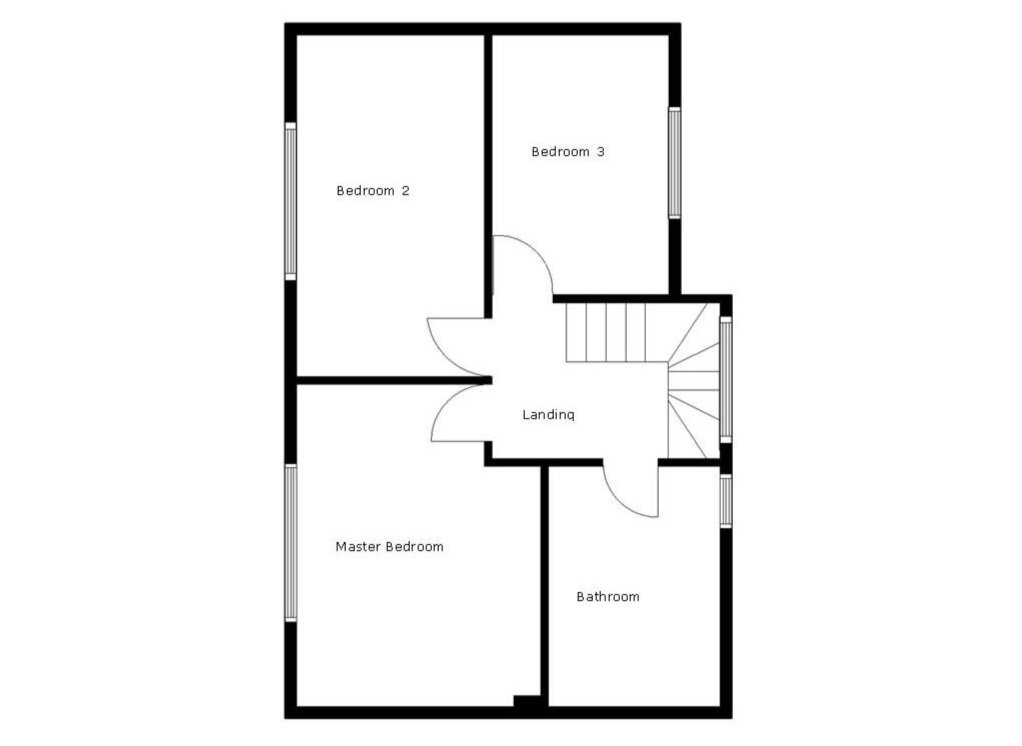
When we started the re-design of this home, there was just one rather large bathroom on the first floor, plus a downstairs toilet. One bath/shower space for the maximum occupancy of eight people really wasn't sufficient so I set about thinking how we could create two separate bathrooms.
When separating a room, the first thing to consider is the accessibility of the new space. Luckily, the existing bathroom was located on the other side of the wall from the biggest bedroom so it was an obvious decision to separate it in two, creating a master bedroom with en suite. The rest of the bathroom space would serve as a larger bathroom for the second bedroom and kids' room.
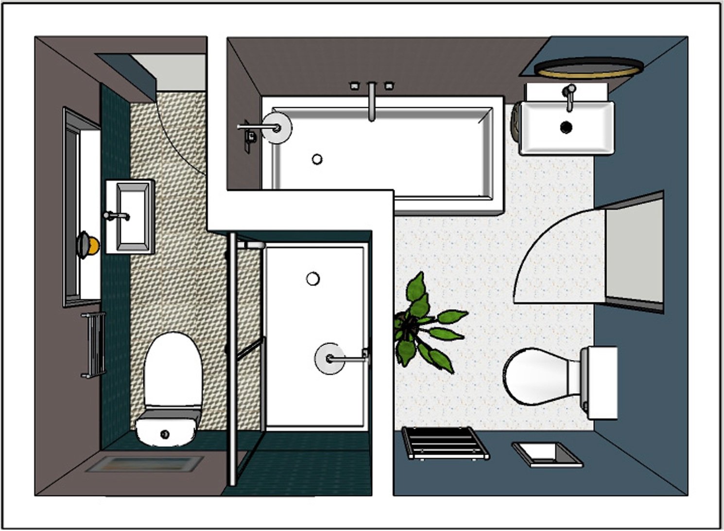
Bathroom and En Suite Layout Plans
The original size of the existing bathroom was 3.04cm x 2.08cm (approx 20 square feet). We wanted to incorporate a bath in the larger room, with a shower area in the second bathroom. I got to work on the layout planning and found a great way of separating the space, using the new stud wall as a bath screen in the house bathroom. I made sure that the length of this wall was the perfect size for a shower tray to be slotted in on the en suite side. The bath is 1500 x 700 and the shower tray in the en suite is 1200 x 700 so it’s lovely and spacious.
The Interior Design Schemes
In keeping with the rest of the house’s designs, we wanted to give the bathrooms a relaxing, coastal feel so we used a colour palette of pale pink, blue and green. My mum and dad were renovating the whole house at the same time and the budget was quite tight so we needed to make sure that the new fixtures and fittings were affordable. We stuck with chrome tapware which is generally cheaper than other finishes and we kept the toilet in the main bathroom in it's existing location which saved on fitting costs.
After
Main Bathroom
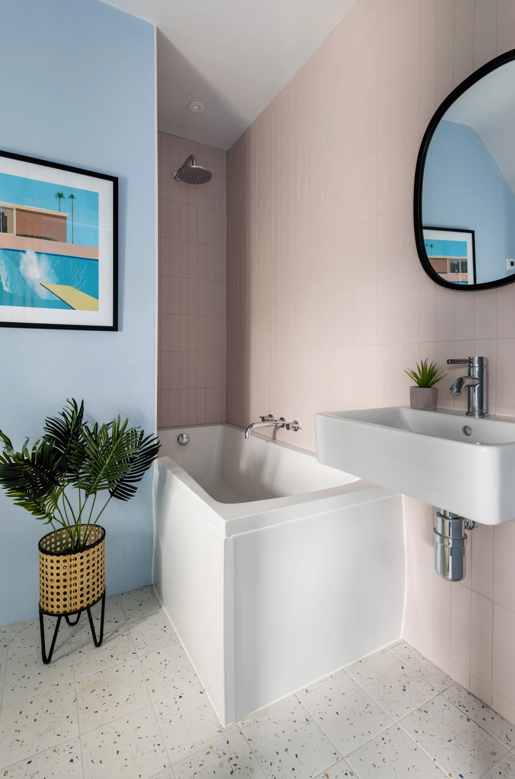
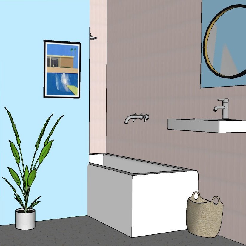
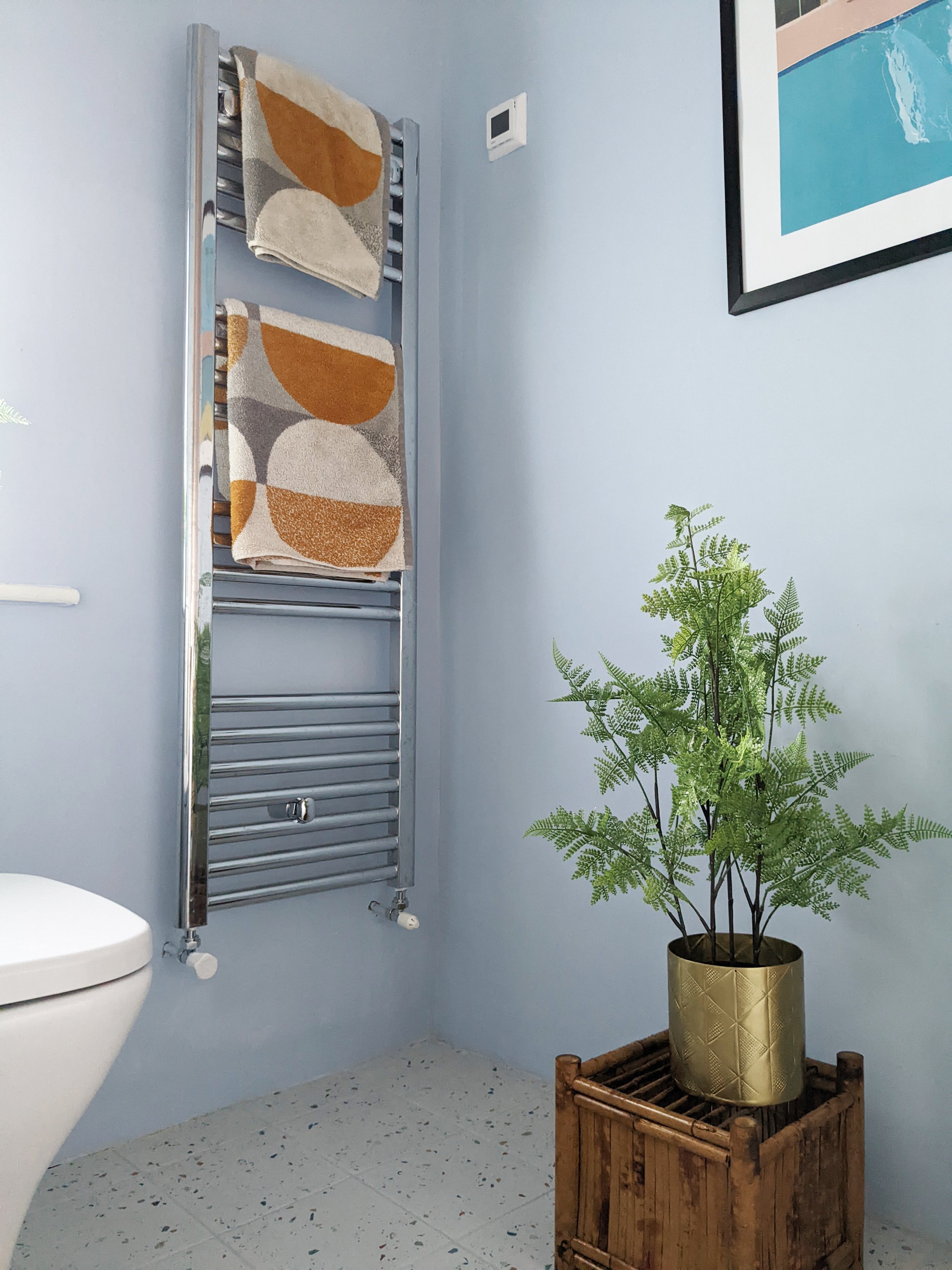
There isn’t a lot of natural light in here because the window is quite small and the west facing light that does come through is cool apart from in late afternoon/evening. I chose a pale blue for the walls (Mineral Mist by Dulux) with pink wall tiles to add warmth. It feels so calming. The Tutti Frutti Terrazzo tiles from Porcelain Superstore introduce subtle pops of yellow and the black wall mirror and picture frame help to ground the space - always important to incorporate a bit of black in pastel colour schemes so that they don’t feel wishy-washy. A good way of making small bathrooms feel bigger is to opt for a wall hung basin or vanity unit so that you can see more of the floor. There wasn't enough space for a separate shower here so we added a shower head over the bath.
David Hockney’s ‘A Bigger Splash’ print is perfect for this space! It pulls together all of the colours and gives a nod to the mid-century era of the house. The tiles are the Oska Powder Pink Matt Porcelain tiles from Mandarin Stone and we arranged them vertically to make the ceiling feel higher.
The geometric towels add another yellow colour pop and add to the warm feel. I sourced the mid-century plant stand from eBay.
En Suite
The master bedroom now has its own bathroom! It was really important to create a nice flow from the bedroom through to the en suite so I found a lovely soft pink paint for the walls (Blossom Tree by Dulux) with mint green ceramic wall tiles. It’s a small space so again, I chose a small wall-hung basin to make it feel bigger. You can see more of the master bedroom in my final reveal blog post.
We didn't want to tile the entire bathroom because of the extra cost involved so we just added wall tiles up to half way in the toilet and sink areas. The colours flow beautifully through from the bedroom and I chose a Liz Jameson seascape from King and McGaw to add to the coastal feel. In a small room, it’s a good idea to choose a shower door in a sliding style, rather than a hinged one.
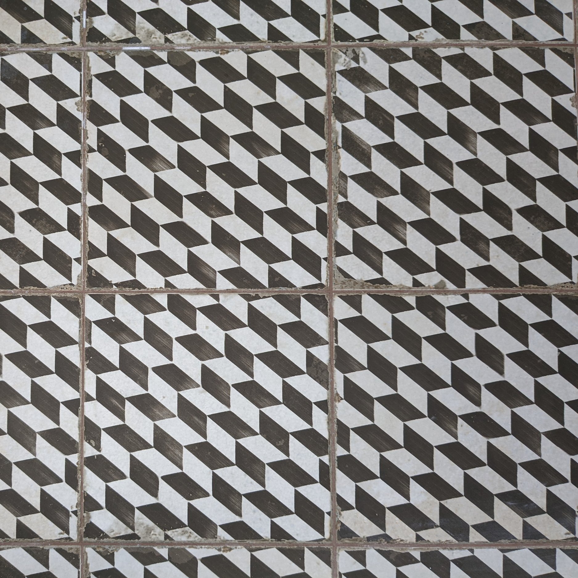
The grout on the wall tiles looks a bit pink here but it’s actually a pale grey - the colour on the walls and ceiling reflects on to the tiles creating a lovely pink tinge. I chose geometric floor tiles to ground the space and create a vintage feel. They’re the Metropolis Geometric Wall and Floor Tiles from Tile Mountain. For more bathroom flooring ideas, take a look at my blog post here.
So there you go - a beautiful master bathroom and separate en-suite which has made this house so much more functional. If you’re planning on separating your bathroom into two separate rooms, I hope this has helped. Let me know in the comments!
I'm a West Yorkshire based interior designer and I also provide an online interior design service. If you're starting a bathroom project and would like some help, please get in touch.

