10 Easy Ways to Update an Old Kitchen on a Budget
Today, I’m sharing the final reveal of the kitchen in the North Wales holiday home. The kitchen is often the heart of the home so it needs to look great but also work on a practical level. Kitchen renovations are notoriously expensive and take a lot of time but we had a tight budget so we needed to update the kitchen in the most cost-effective way. We completely transformed the look and feel of the space and I’ll be sharing lots of budget kitchen ideas.
You can see the final reveal of the dining area of this kitchen in my previous post here.
Before
The Howdens solid wood units were in really good condition and we were happy with the overall layout. Generally, a good kitchen layout has the fridge, hob/oven and sink forming a triangle shape so that the space works efficiently without too much space between each of the key areas. Although the layout worked, we were a bit short of worktop space.
Ugh! The horrible boiler on show. Why would anyone do that? And the ugly washing machine too. I don’t know 😩.
We removed the old sliding doors to create more of an open plan feel. Because we were using the adjoining room as the dining room, we no longer needed a dining table in the kitchen so that went.
The Interior Design Sceme
The kitchen design ties in with the overall coastal theme of the house, with a main colour palette of green and blue with pops of colour in the accessories. We also introduced geometric pattern in the tiles and tactile textures such as concrete and linen.
After
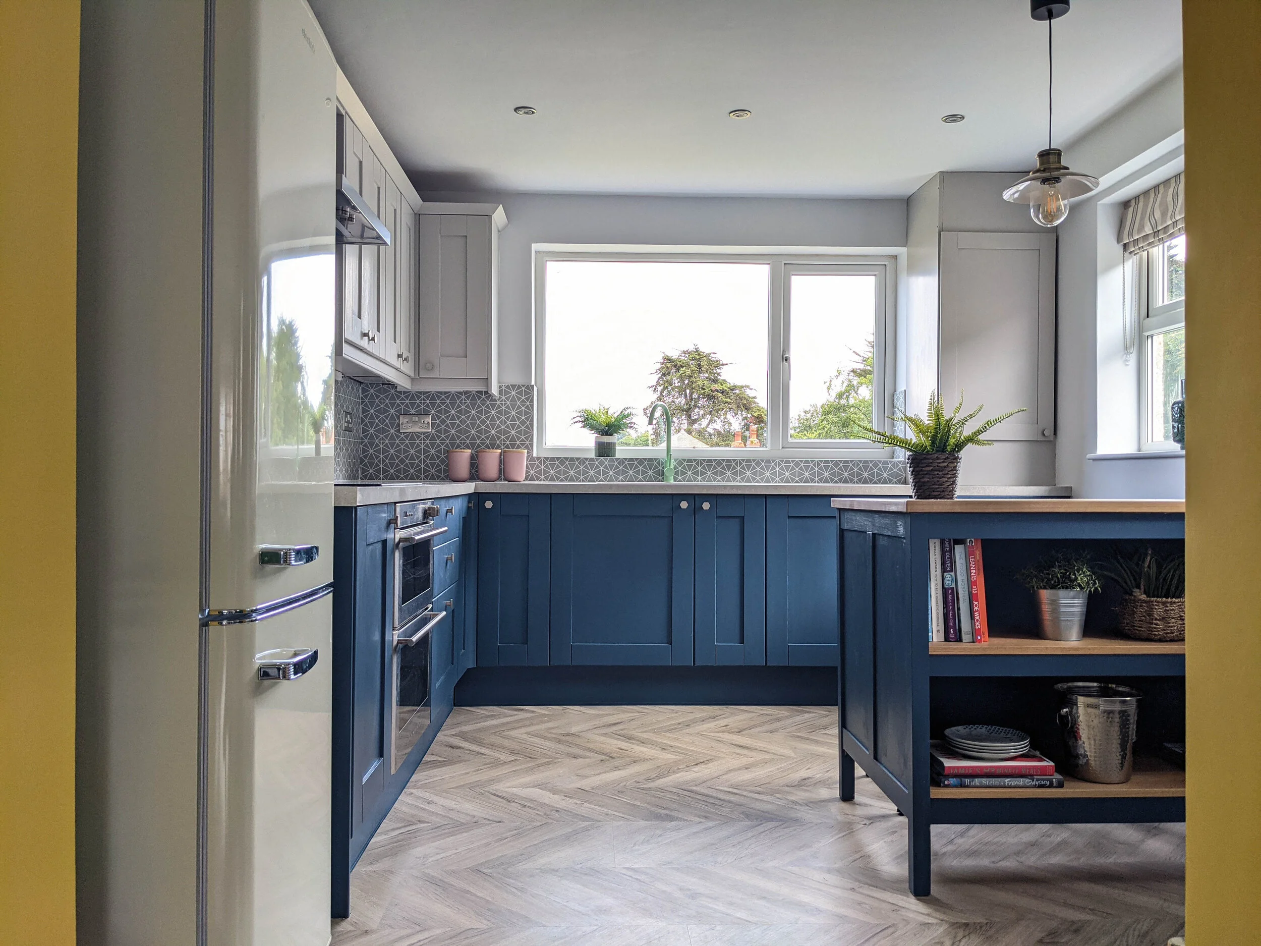
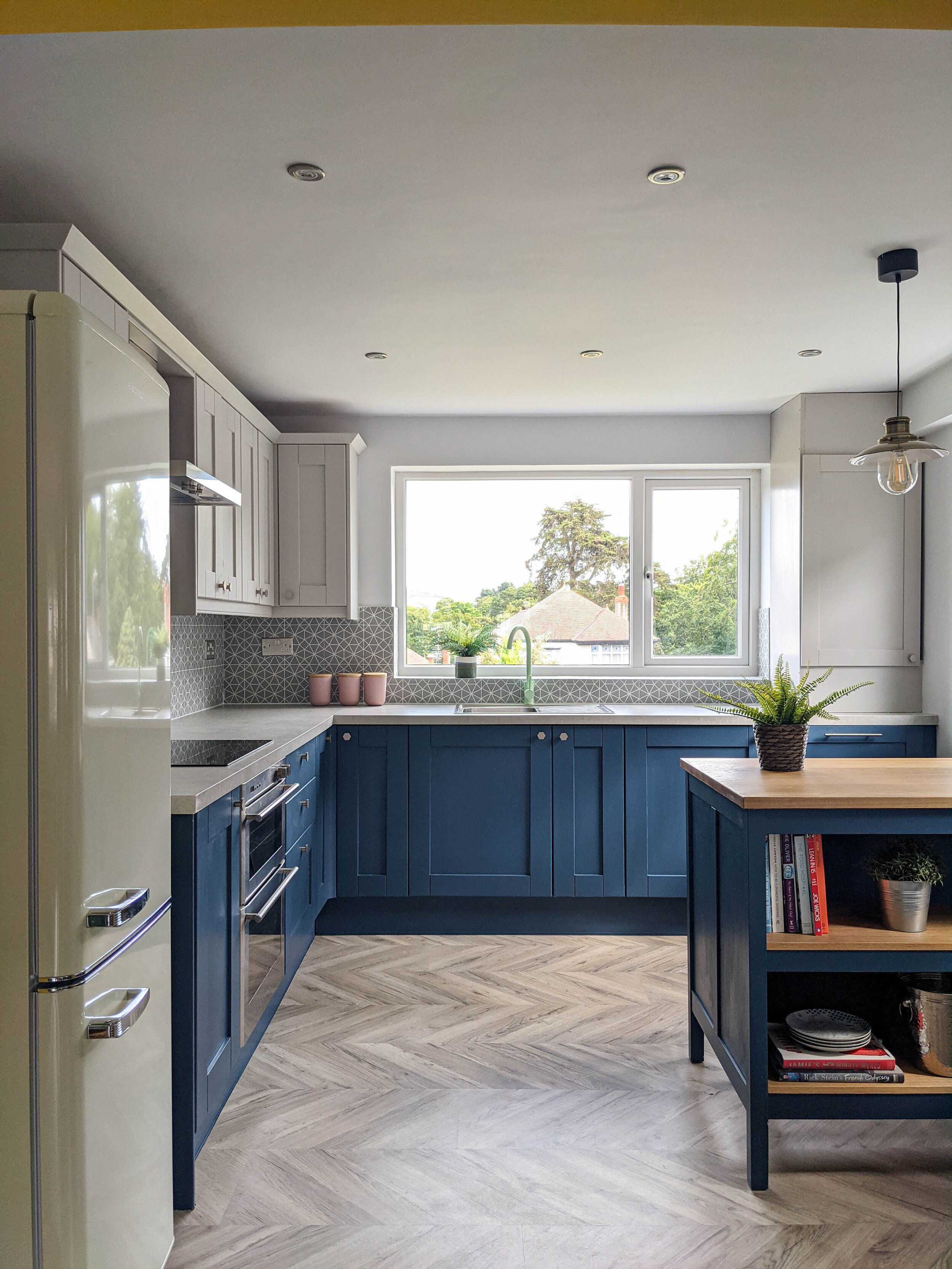
Now for the after pictures with my 10 top tips for transforming a kitchen on a budget.
1. Paint the units
If you don't love the look of your kitchen but it's in good condition, give it a refresh with paint. It's a really easy way of creating a new look. I chose a bold colour for the base units for a big impact. We used Zinsser Bulls Eye primer on the cabinet doors and drawer fronts, followed by two top coats of Little Greene’s Hicks Blue in Intelligent Eggshell for the base units and French Grey for the wall cupboards. I’ve had a few clients recently who’ve used specialist kitchen spray companies. Some also offer a tile and worktop spraying service. If the cupboards are looking a bit worse for wear, an alternative is to get new doors for the existing carcasses - more expensive than painting them but much cheaper than a full kitchen remodel.
2. Add an island
A kitchen island doesn’t have to cost a fortune. This Tornviken island from IKEA was just £250 (bargain!) and fits perfectly in the space between the back door and the window. It comes in cream or grey so we we primed it and then painted it to match the base units. As well as providing additional worktop space, there's a breakfast bar area and open shelving for extra storage space.
3. Change the splashback
Create a fresh look with a new splashback. These Astrid porcelain tiles from Mandarin Stone introduce geometric pattern, perfect for the mid-century era of this house. They've had a huge impact on the look and feel of the kitchen.
4. Get a cool tap
We saved on the sink (it’s the Vattudalen from IKEA) and spent a bit more on the tap. This isn’t the first time I’ve used the Tinkisso tap from Dowsing and Reynolds - I used it in the pink colourway in my Edwardian terrace kitchen project. Here, the mint green adds a pop of colour and complements the blue of the kitchen units and the teal in the adjoining dining room perfectly. It might seem like a small change but it's made a really big difference!
5. Replace the lighting
Kitchen lighting is really important for practical reasons. We ditched the old strip lighting and introduced downlights, with under cabinet lighting and a pendant light over the breakfast bar. The style of the fisherman pendant from Iconic Lights ties in with the industrial feel of the concrete effect worktops.
I love these Andy Warhol ice cream prints from King and McGaw! Perfect for a holiday setting.
6. Get new flooring
Flooring is super important in interior design and it can make or break a scheme. Good options for a kitchen floor include tiles or LVT (luxury vinyl tile). With our limited budget, we opted for a more affordable Signature laminate flooring from Discount Flooring Depot (we got it for £18 per metre square). It’s in a herringbone pattern on large boards and is easily fitted using a click locking system. It also comes with a 20 year residential warranty.
7. Update the handles and worktops
One of the easiest ways of creating a modern look is with the handles and worktops. Cabinet handles are at eye level and you’re constantly touching them - they’ll always be noticed so invest in good quality ones. See how these hexagonal ones from The Hairpin Leg Company match the pattern in the tiles? Instead of choosing a pricey quartz worktop, opt for more affordable laminate kitchen countertops. IKEA have a great range. this one is from Howdens and the concrete effect laminate adds lovely texture and a bit of an industrial vibe.
8. Conceal ugly things
Make sure all white goods are concealed behind doors. Previously, there was a washing machine on show along the window wall at the end and there was a tumble dryer next to it, concealed behind a door. We moved the dryer to the previously unused space under the stairs and then moved the washing machine along. This created space for a dishwasher in here - a must have in a house which can sleep 8! We sourced a nearly matching door from Howdens to conceal the dishwasher and we had the boiler boxed in, painted the same colour as the units to blend in. It's made such a big difference.
9. Keep existing appliances
New appliances can cost a lot so consider keeping some of the existing ones. The existing oven here had hardly been used so we just changed the hob and extractor. We kept the existing washing machine and the homeowners already had the dishwasher from a previous property. A retro style cream fridge freezer replaces the awful white one.
10. Do some of the work yourself
Leave the electrics to a professional but consider doing the rest of the work yourself. It might be time-consuming but just painting the units yourself could save you a lot of money. If you’re a confident at DIY jobs, you might also try doing some of the other work, such as tiling and replacing the sink and worktops.
The cost
So, what was the total cost for this room?
Island - £250
Tiles - £120
Tap - £100
Cabinet handles - £70
Fridge - £449
Sink - £80
Stools - £180
Extractor hood - £200
Worktops - £362
Hob - £200
Flooring - £160
Lighting and electrics (including electrician costs) - £200
Wall art - £50
Paint - £200
Bar stools - £118
Blind - £76
TOTAL COST - £2,815
This outdated kitchen has been given a new lease of life - not bad for under £3k! I hope I've given you some ideas for your own budget kitchen makeover - let me know in the comments. For more ideas on how to refresh an old kitchen at an affordable price, take a look at the kitchen-diner reveal at my new build project.
I’m a Halifax based interior designer and I cover surrounding areas, including Leeds and Manchester. I also provide an online design service. If you’re starting a project and need some help or inspiration, please get in touch.


