Colourful Nursery Decor Ideas - Baby Boy's Room Reveal
I’ve been working with some lovely clients on their Edwardian Terrace in Halifax for a few years now and I’m excited to share the reveal of their baby's nursery! As an interior designer who loves solving problems for my clients, I like nothing more than a tricky floor plan to sort out and this project definitely provided that....
The clients moved in when they were pregnant with baby no. 1 (now aged 3) and by the time baby no. 2 came along, the upstairs space was no longer working for them. There were a number of issues with how they were utilising the space. Bedroom no. 4 was being used for storage and the ensuite was in the room they were using as the guest bedroom. You can see from the original floorplan that bedroom no. 3 had just about enough room for a cot, small wardrobe and chest of drawers, so not ideal for a 3 year old or a newborn baby and their mountains of clothes and toys.
The original floorplan
We decided to move the youngest boy to bedroom no. 1 (previously the guest room), ripping out the existing ensuite and moving it to the opposite end of the room to create a master en-suite.
The eldest boy got the biggest room in the house on the second floor, where there was plenty of room for sleeping and playing. Because it’s such a big space, there’d be room to incorporate a double sofa bed for guests in future if needed.
We decided to turn bedroom no. 3 into a combined dressing room and home office.
The Interior Design Brief
The brief for the nursery design was to create a comfortable and inviting space that can be easily updated in future when a refresh is needed. A play area and the existing cot had to be incorporated into the scheme, with enough room to accommodate a single bed for when the cot is upgraded. And because the pipes for the ensuite had to run through this bedroom, they needed to be cleverly concealed.
Before (Estate Agent’s picture) - the wall-to-wall wardrobes were concealing a chimney breast and alcoves so they were taking a lot of space off the room. The door on the right is to the existing ensuite.
We decided to have a wardrobe built in to the alcove and the whole wall above built out, carrying it along all the way across the alcove and chimney breast. The pipes for the ensuite could be concealed behind the false wall with recessed shelving above, and the room would be a nice rectangular shape.
There’s the studwork for the ensuite going up.
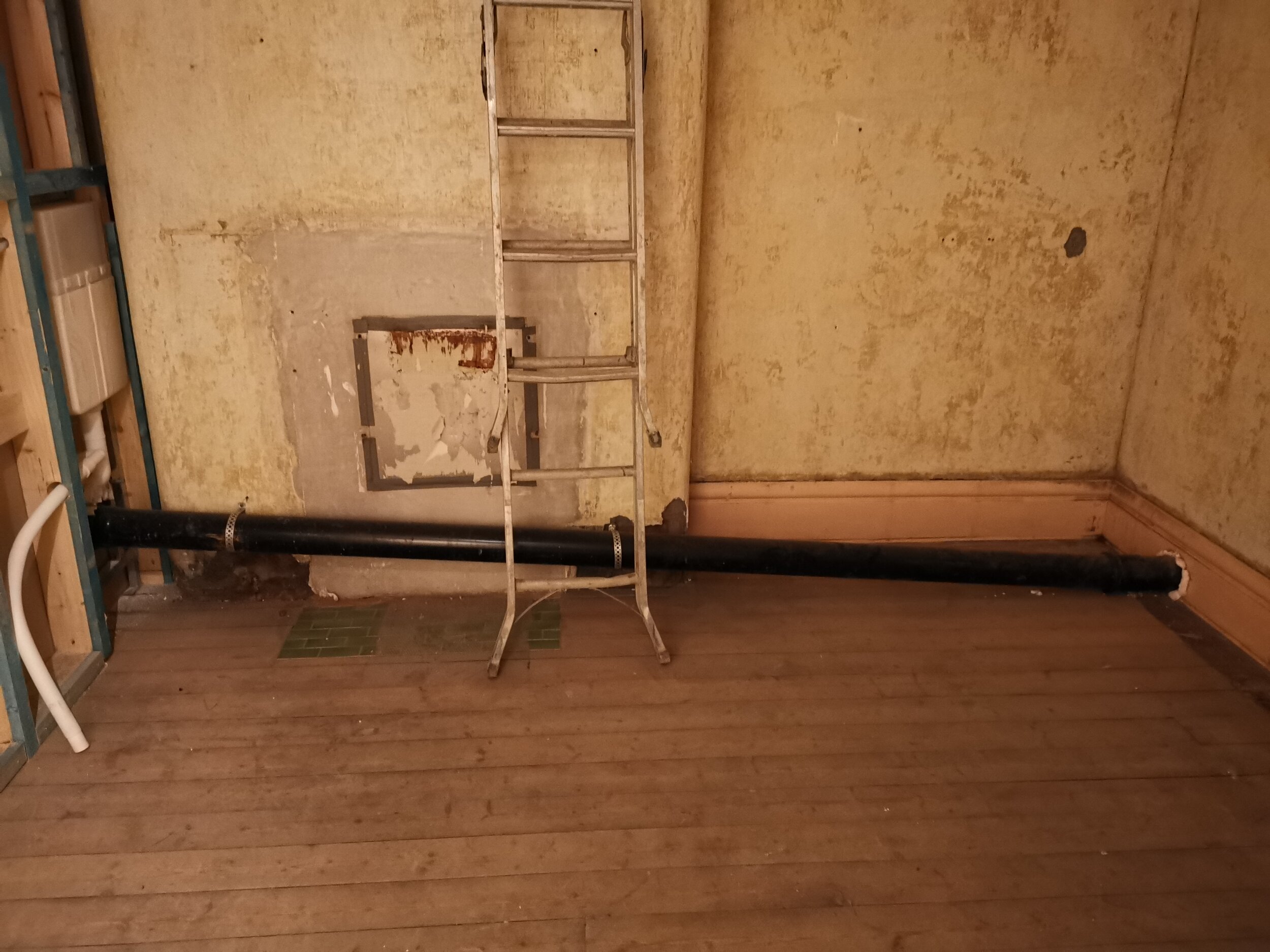
Look at the lovely green tiles we uncovered - you can see more of them in the master bedroom and en-suite reveal! And that’s the lovely soil pipe running in front of the chimney breast.
The Interior Design Scheme
As part of my design process, I create an interior design board so that clients can see how all the items I’ve chosen for the scheme work together.
To allow the room to be easily refreshed in future, and to keep costs down, I suggested that we stick to paint rather than wallpaper. I’m a little bit obsessed with original floorboards so the decision was made to restore them and stain them a warm, mid-oak colour. The husband was willing to do the work himself (I use the term ‘willing’ loosely - he didn’t really have a choice) so this was a cheap and practical option. For DIY advice on how to restore floorboards, read my blog post here. Together, we chose a light blue for the walls with accent colours of darker blue, yellow, green and red. A lovely, colourful room!
The clients initially asked for the room to be painted in neutral colours. So many clients start off saying this! It’s not that they don’t like colour, it’s that they’re afraid of getting it wrong so they prefer to play it safe. But, depending on the lighting in the room and the type of neutral you choose, you could end up with a cold, soul-less space. Colour really sets the mood and it’s an easy way of making a big impact for a low cost. Plus, colourful nurseries are so much more fun! It’s my job as an interior designer to give my clients ideas they wouldn’t have thought of themselves, to push them out of their comfort zone, and often that means giving them the confidence to be a bit bolder with colour.
The Colour Scheme
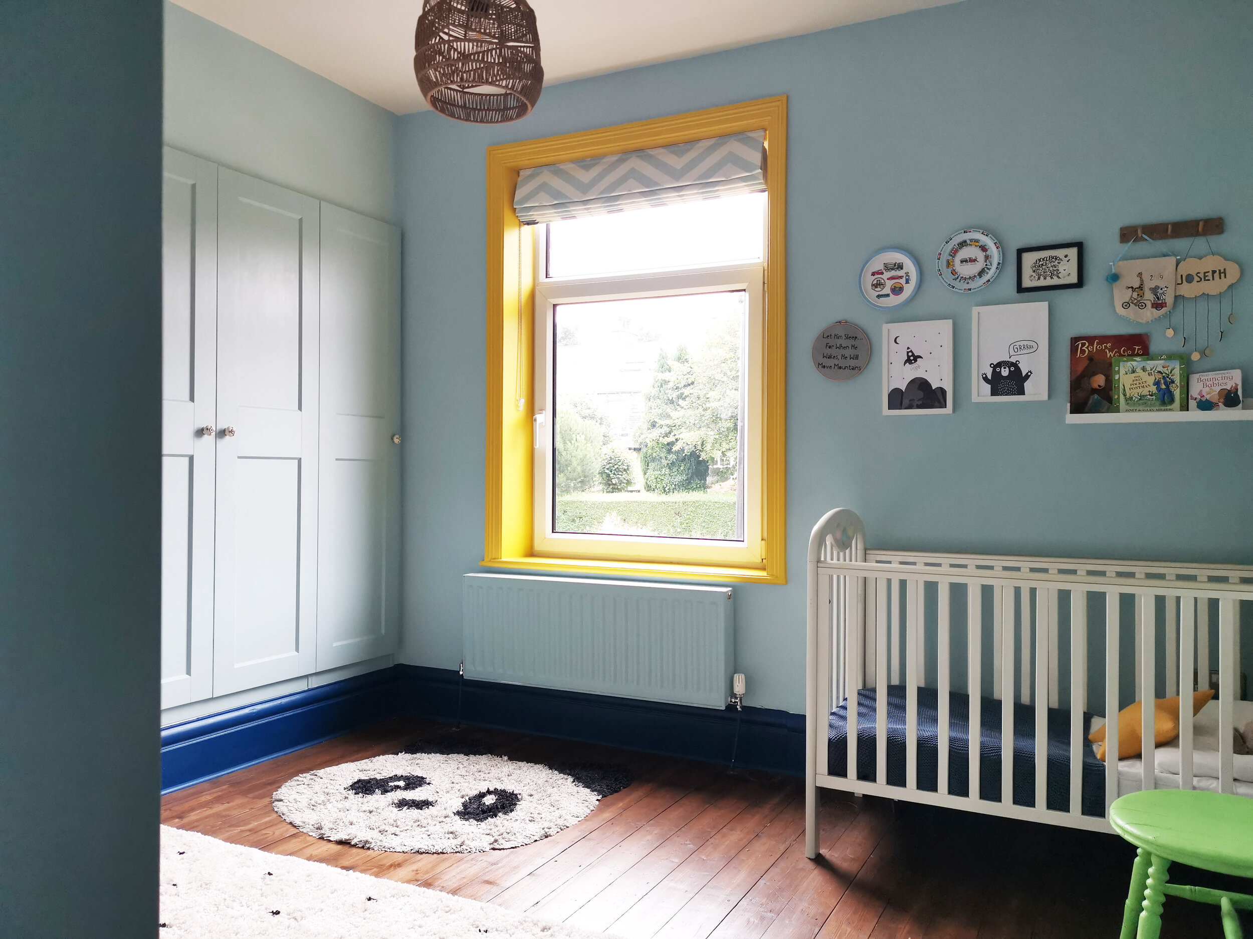
Using warm blues is a great way of creating a calm and soothing feel so I chose Brighton by Little Greene for the nursery walls and we decided to paint the built-in wardrobes in the same shade for a seamless look. The skirtings were highlighted in a deep blue (Little Greene's Deep Space Blue) and we added a pop of bright colour on the window frame with Mister David (love that name!). We also dotted bright green accents around the room to make things more interesting. The rattan light shade adds warmth and texture.
For the wall decor, I created a wall mural with stickers from Hartendief as a fun way of filling the blank wall next to the cot. How amazing are they?! And when the room needs a refresh in a few years’ time, they’ll peel off without damaging the paintwork. And how cute is this chair?! It was £5 - FIVE POUNDS!!! - off eBay….because the seat is flat, it can be used as a bedside table when baby gets older. The light up moon completes the rather lovely scene.
For the wall art above the cot, we displayed a collection of prints, plates and books - high enough up so they can’t be reached by little hands.
The False Wall
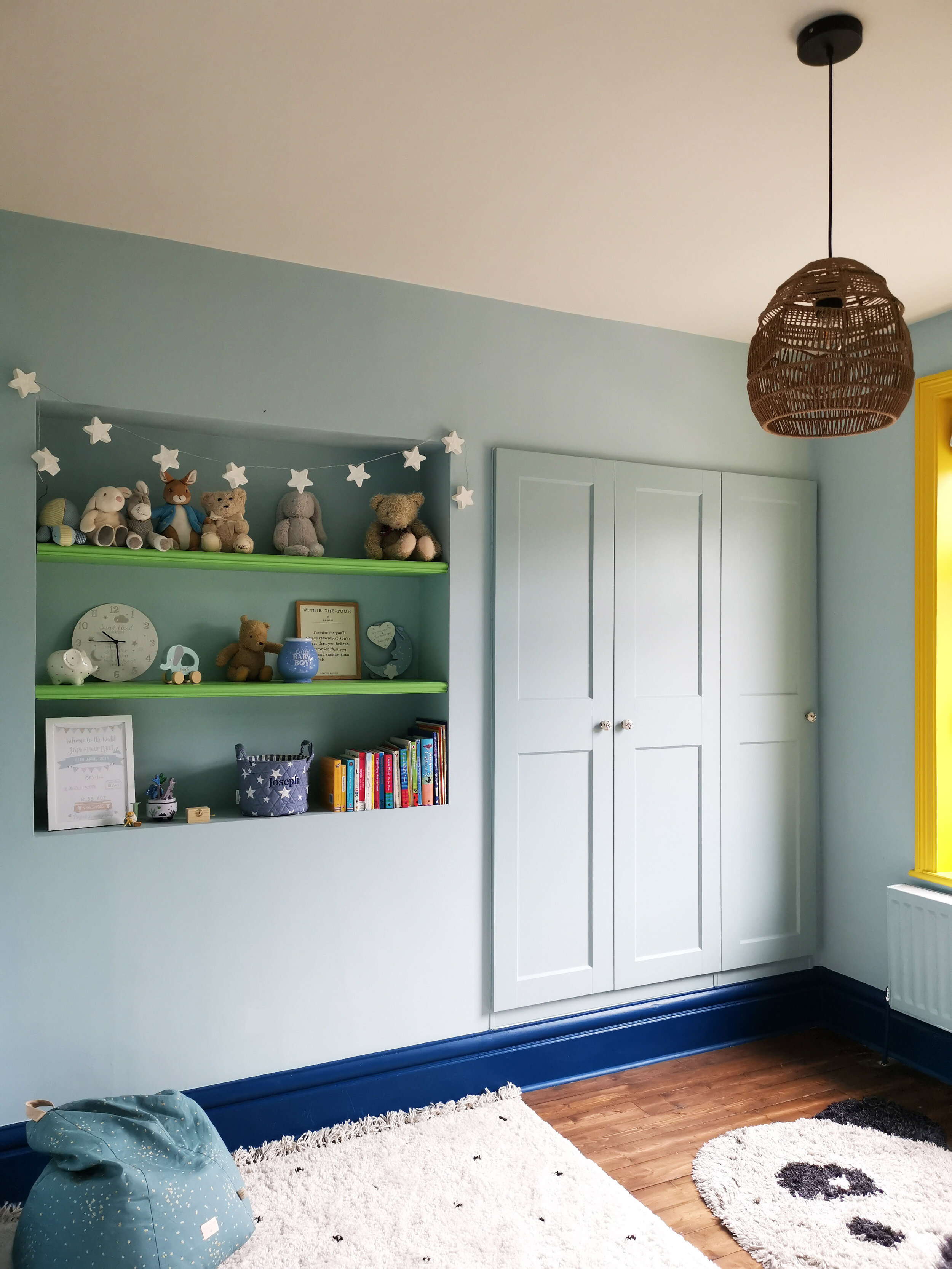
Ah, the false wall! You’d never know there was a soil pipe behind there would you? The IKEA Pax wardrobes work brilliantly built in to the wall and there’s enough room in them to hold all the baby clothes and household sheets and towels. Don’t you just love a good IKEA hack?! A joiner built the floating shelves into the recess and patched up some missing pieces of skirting board. The shelves are painted in Little Greene’s Phthalo Green (to match the chair) and I filled them with lots of bright toys and books that they already had. See how the white stars on the blue basket match the fairy lights? The one thing the budget couldn’t quite stretch to was a new cornice. Because the original one had been removed, I recommended getting a mould made of another cornice in the house but this is something that can easily be added in future.
The Play Zone
Soft textures are really important for adding a cosy feel. I sourced a lovely area rug from La Redoute and I added another plush rug in a panda shape - perfect for little knees. I always try to include wooden accents in a room because natural materials help to add warmth and character. We didn't need too many wood pieces here because of the wooden floorboards but the old blanket box was a £10 vintage buy and it’s the perfect place to store toys. The beautiful bear prints are perfect for a baby's nursery and they pick out the different colours in the room perfectly.
This space has been completely transformed into colourful, cosy baby's room that will grow with him. I’d love to know what you think. Let me know in the comments below!
If your child’s room needs a refresh and you don’t know where to start, please get in touch. I’m based in Halifax, West Yorkshire and I also offer a remote design service.


