Dark Green Hallway Design - Before and After
After
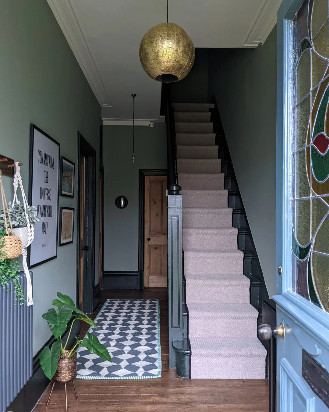
The dark green hallway design at my Edwardian terrace project is one of my most popular rooms on Pinterest so I thought I'd write a post about what we did, with useful details including paint colour names. I’ll also include a source list at the end of the post. If you're a bit nervous about introducing dark colours in your home, transitional spaces like hallways where you don't tend to spend a lot of time are great places to start. Plus, darker colours in a hallway make the rooms coming off it appear lighter.
Before
This hallway was previously very tired and hadn't been redecorated since the clients had moved in. It's east facing and the only light coming in is through the front door so it's quite a dark space. With little natural light to introduce light and shade, the pale off-white walls only made it look more dull.
I wanted to create a dramatic entrance for this home, highlighting the original features, while still maintaining the relaxed feel we'd created elsewhere in the house. I knew that I wanted to introduce deep hues to bring it to life - embracing the dark in a room that doesn't have much light can make the space feel cosier and more inviting.
The colour scheme actually started with the front door. The main thing on my client's wish list was to replace the white PVC door with an original Victorian/Edwardian one - this is one of the best things you can do when restoring a period home. I sourced the front door from local door restorer, Falcon Pine, and we decided to pick out the green in the beautiful stained glass window as the hallway's main hue. After trying different green paint colours, we decided on Windmill Lane by Little Greene Paint Company - a muted shade that has depth but feels soft. I recommended using a darker shade of green for the woodwork to make the lovely details stand out. We chose Obsidian Green which looks almost black in rooms that have a lack of natural light. This house has high ceilings so I recommended painting the ceiling and cornice in a lighter colour - French Grey Pale. In a house with lower ceilings, painting the ceiling and walls the same colour is a good way of making the ceiling feel higher.
Before
After
The clients had removed the carpet soon after moving into the house, with a view to restoring the original floorboards. They sanded them before applying Liberon floor dye in Medium Oak and finishing with Liberon’s natural finish floor varnish in Clear Matt.
After
For softness, we added a warm grey runner on the stairs and a black and white runner leading towards the kitchen - it's the perfect size for this narrow hallway, and I love the tile effect as a subtle nod to Victorian encaustic tiled floors.
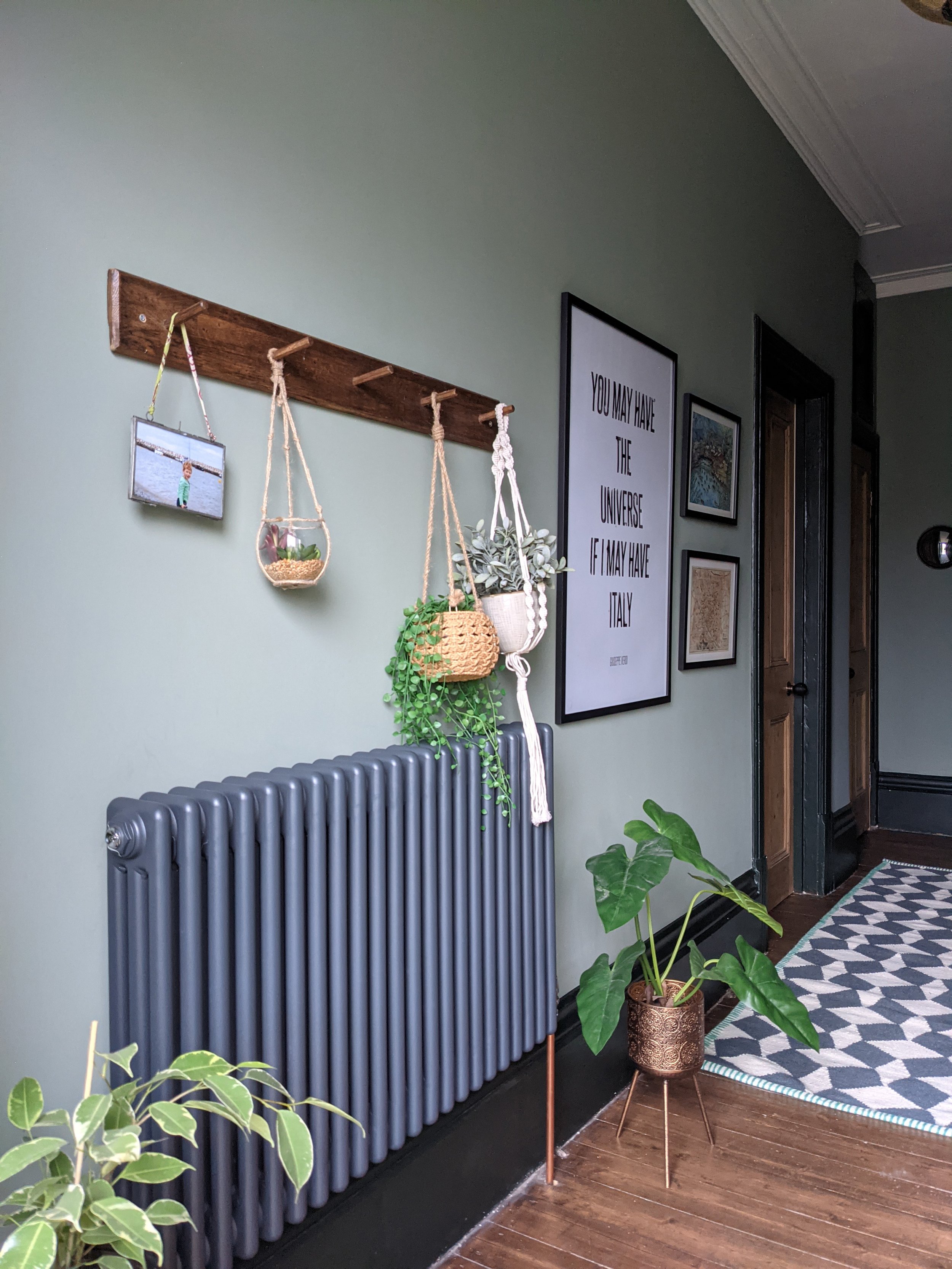
The clients are great lovers of all things Italian so I drew on this as inspiration for a small gallery wall, adding subtle accent colours to pick out the red in the stained glass window.
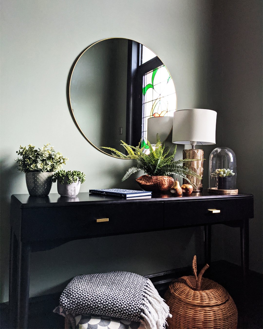
Key to any successful entrance hall design is sufficient storage, especially if it's quite a small space. These clients tend to use their back door as the main family entrance and have shoe and coat storage there but we needed enough space for guests' shoes and coats. I wanted to incorporate a piece of furniture at the bottom of the stairs where things like post and keys could be stored - the black La Redoute console table complements the hallway decor perfectly. Adding baskets is a really easy way of introducing additional storage in an affordable way and natural materials are great for adding texture and warmth to a space so I sourced wicker baskets for shoe, scarf and hat storage, as well as for extra throws.
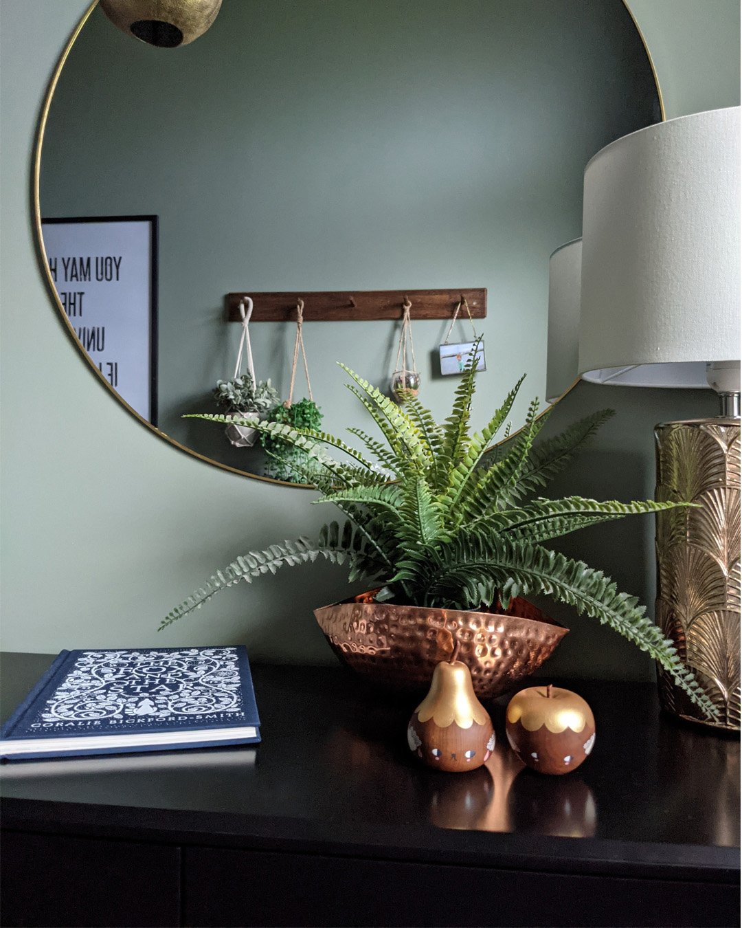
We styled the console with a mix of warm metallics to contrast with the cool green walls, and the large gold mirror above bounces light around the room. The peg rail opposite is handy for guests’ coats.
Hallways don't usually need task lighting so you just need enough ambient light to navigate your way around. We incorporated two ceiling lights in the hallway space - the main one as a feature near the front door, and a simple bulb pendant to light the area at the back of the hall. The lamp on the console table creates a soft, warm glow in the evenings.
SOURCE LIST
Some of the products we used in this design are discontinued but I’ve found similar alternatives which I’ve listed below.
Windmill Lane Intelligent Matt Emulsion for walls - Little Greene
Obsidian Green Intelligent Eggshell for woodwork - Little Greene
Navani black console table - La Redoute
Large rounded frame convex mirror - Graham and Green
Keswick anthracite radiator - Victorian Plumbing
Pendant light kit - Pooky
Apple braided storage - Ferm Living
Spangle ball pendant light is similar - Pooky
Copper hammered bowl is similar - Hortology
Byron tile geometric runner is similar - Dunelm
Thin metal frame round mirror is similar - John Lewis
Scallop lamp base is similar - John Lewis
Inishowen Hessian Wool stair runner is similar - Stair Runners Direct
The peg rail was secondhand off eBay but you can find similar at H&M or Jysk
Dutchbone botanique plant stand is similar - Naken
This hallway feels so much more welcoming and homely - a beautiful entrance that makes a statement. What do you think? Let me know in the comments!


