Dark Green Panelled Bedroom - Final Reveal
It’s final reveal time! I started working on this bedroom project in Halifax late last year. The clients live here with their two young boys and their little one was just about to move into his own bedroom so it felt like the right time for a room refresh. The house is set in lovely countryside with amazing views. It was built in the 1930s but it was in a state of disrepair when the clients moved in. They added an extension and gutted the existing building so it feels more like a new build inside.
After the initial consultation, the clients decided to go ahead with a full room design. Although a lot of my clients prefer to project manage themselves to keep costs down, this couple felt like they had a bit too much on with work and two young boys so they asked me to coordinate the project for them.
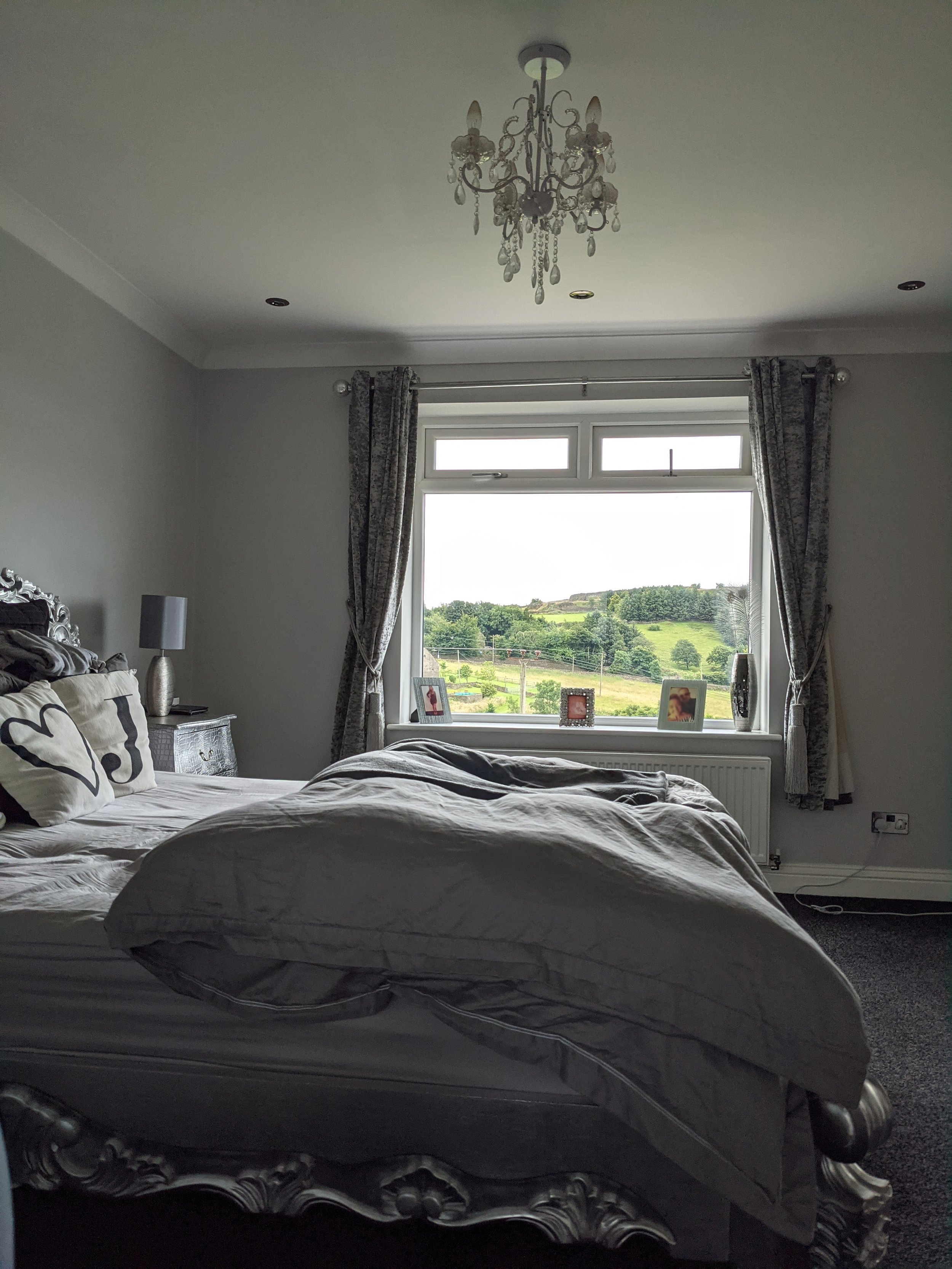
Before
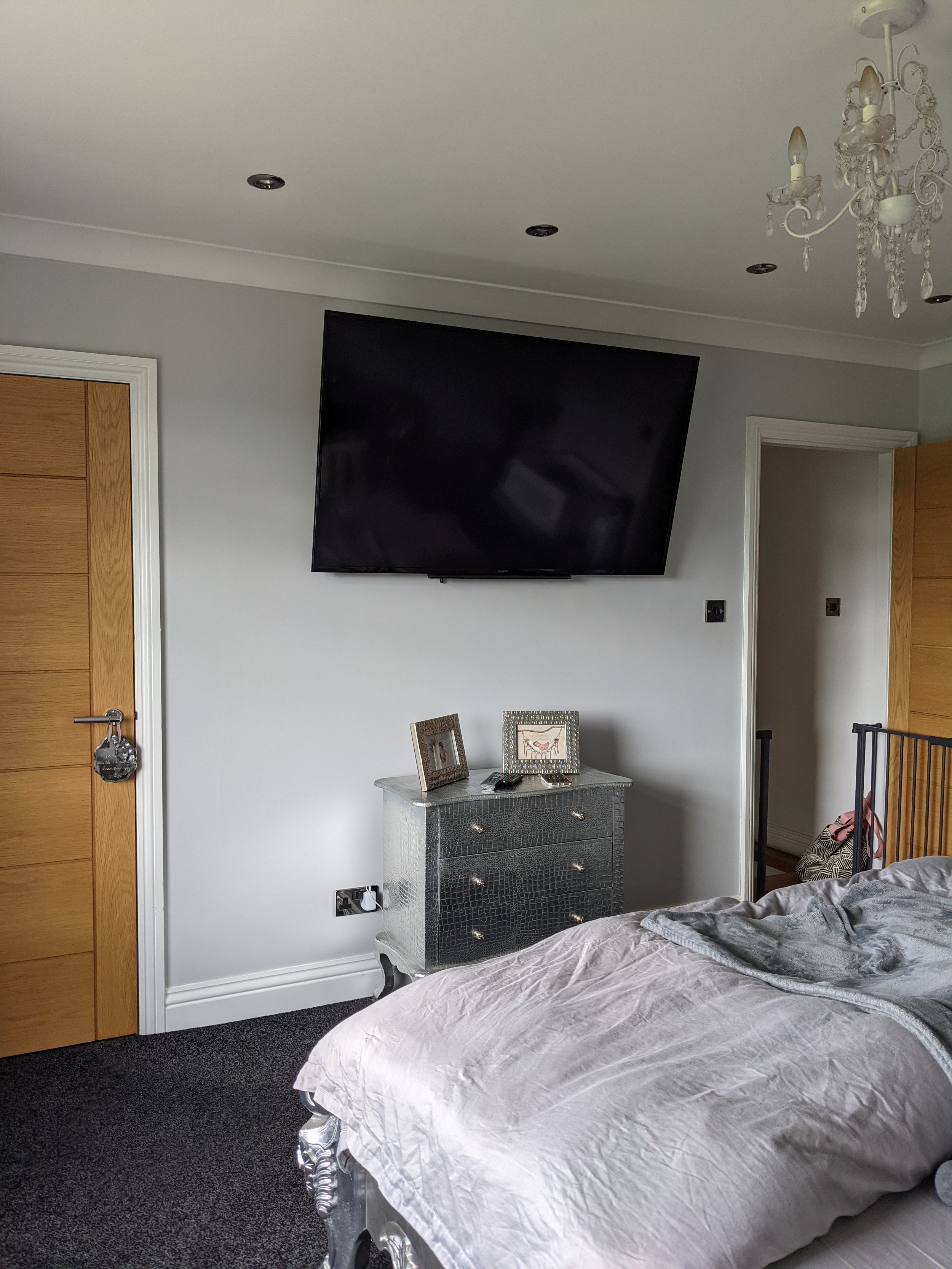
The couple had decorated a few years earlier and, as you can see, the bedroom was looking a bit grey. They were keen to introduce some colour but they weren’t quite sure how to go about it. It’s a south-facing room so we had lots of options when it came to colour choices.
The Interior Design Scheme
Detailed Design Board
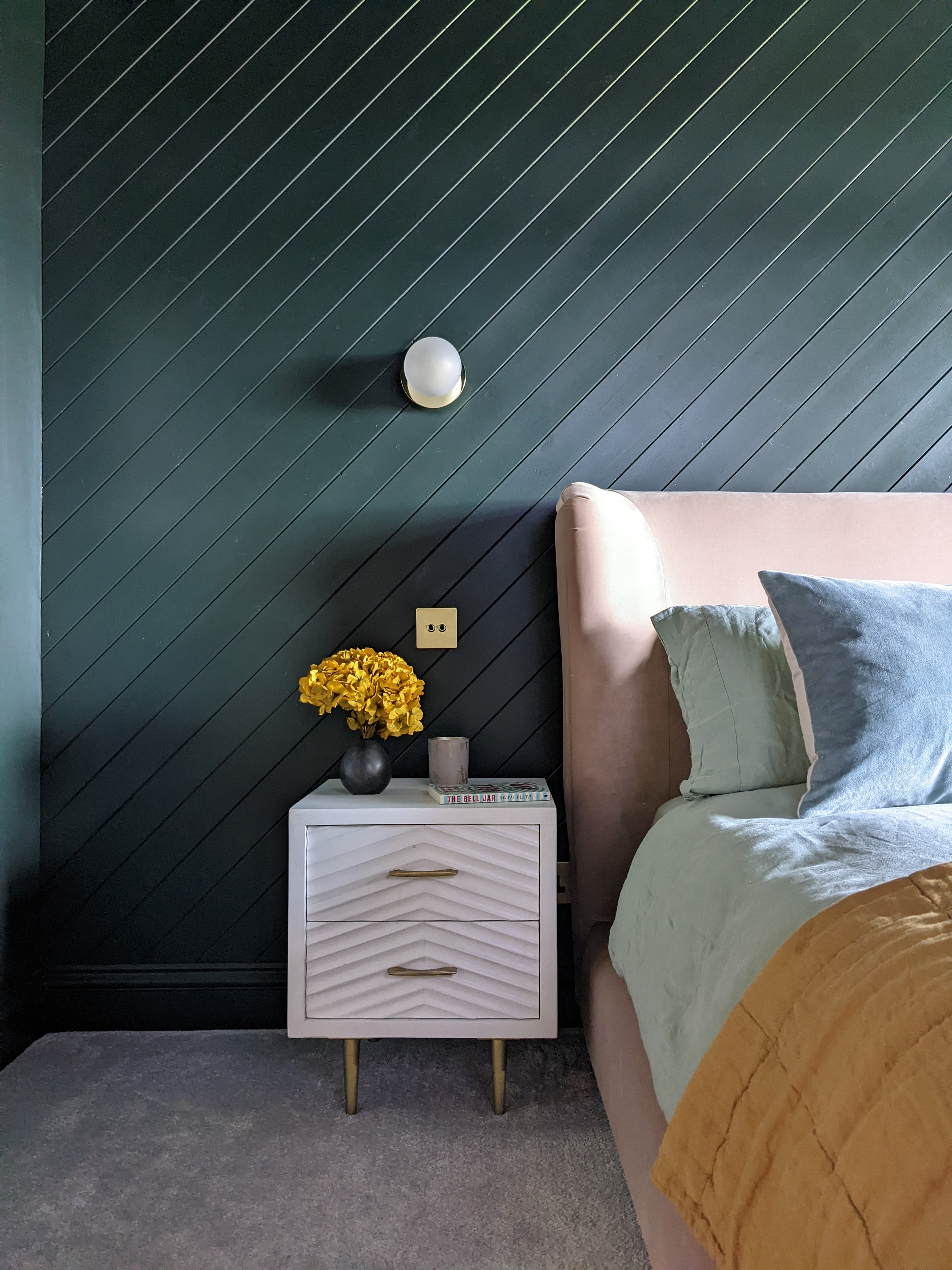
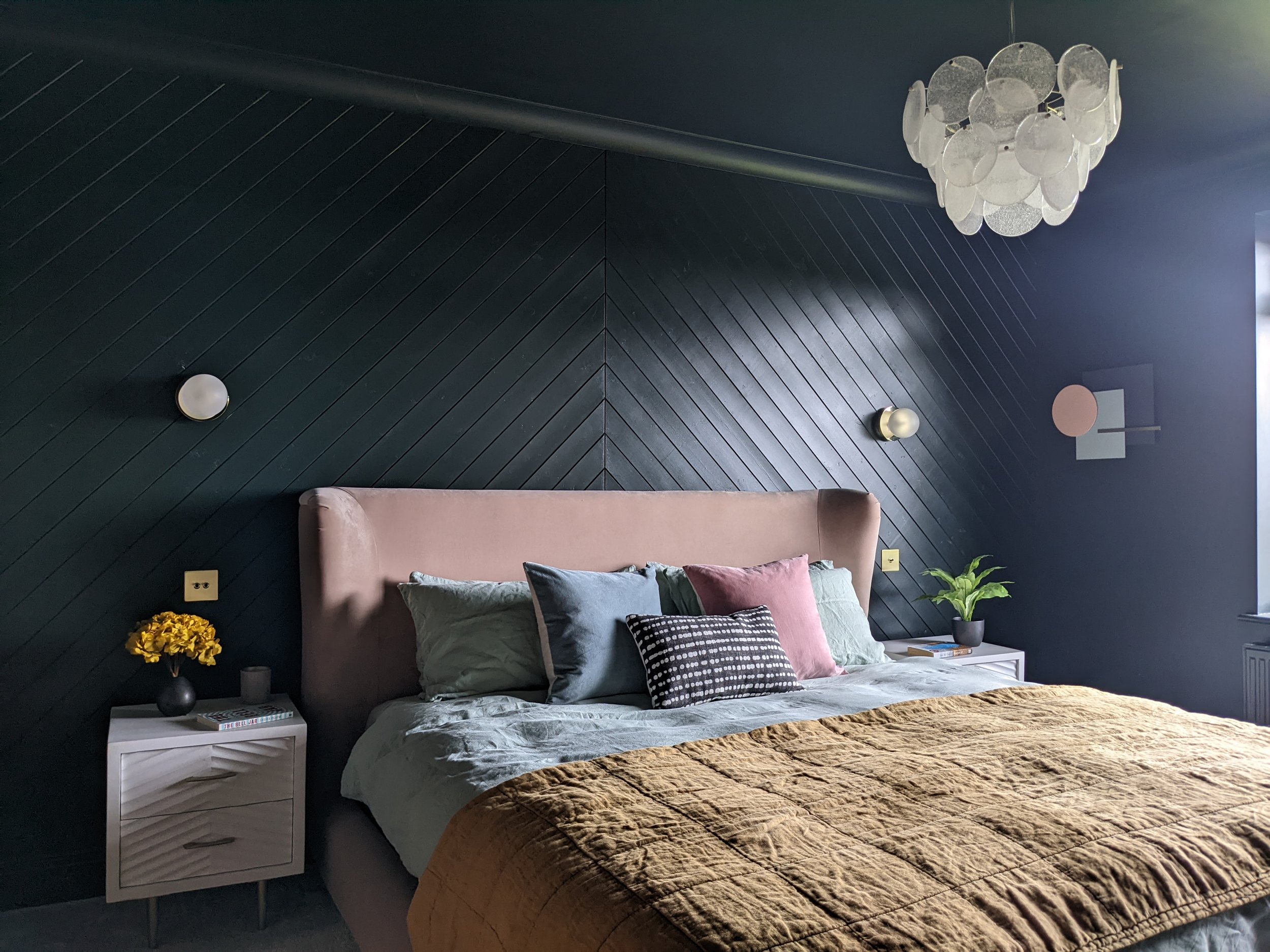
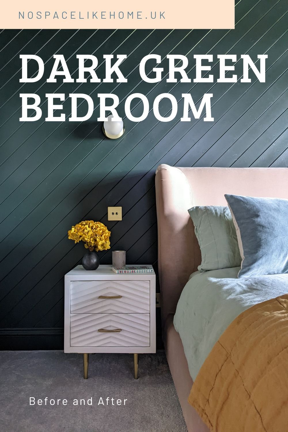
The clients were quite keen on the idea of panelling so we looked at different options. I advised against traditional styles that you’d typically find in a period home - it wouldn’t have suited this space at all. We eventually decided on tongue and groove panelling arranged diagonally in a chevron pattern. It would add lovely texture but would feel really contemporary.
The clients were open to ideas when it came to colour options. They were initially a bit nervous about going dark but as they were keen for a completely different look, they eventually decided to take the plunge. Going dark on the walls, ceilings and woodwork is a great option for rooms where the ceilings aren’t super high because it blurs the line between the walls and ceiling and creates a more seamless feel. It’s great in a bedroom because it has such a cocooning effect. For advice on how to choose paint colours for your home, read my blog post here.
After
The walls, ceiling and woodwork are painted in Obsidian Green by Little Greene. It’s almost black but it looks greener in this space, especially on a sunny day, because of the south facing light. We added contrasting pink and honey colours in the upholstery and soft-furnishings to warm the room up. The Hugger bed from Loaf adds a bit of luxury.
Before
After
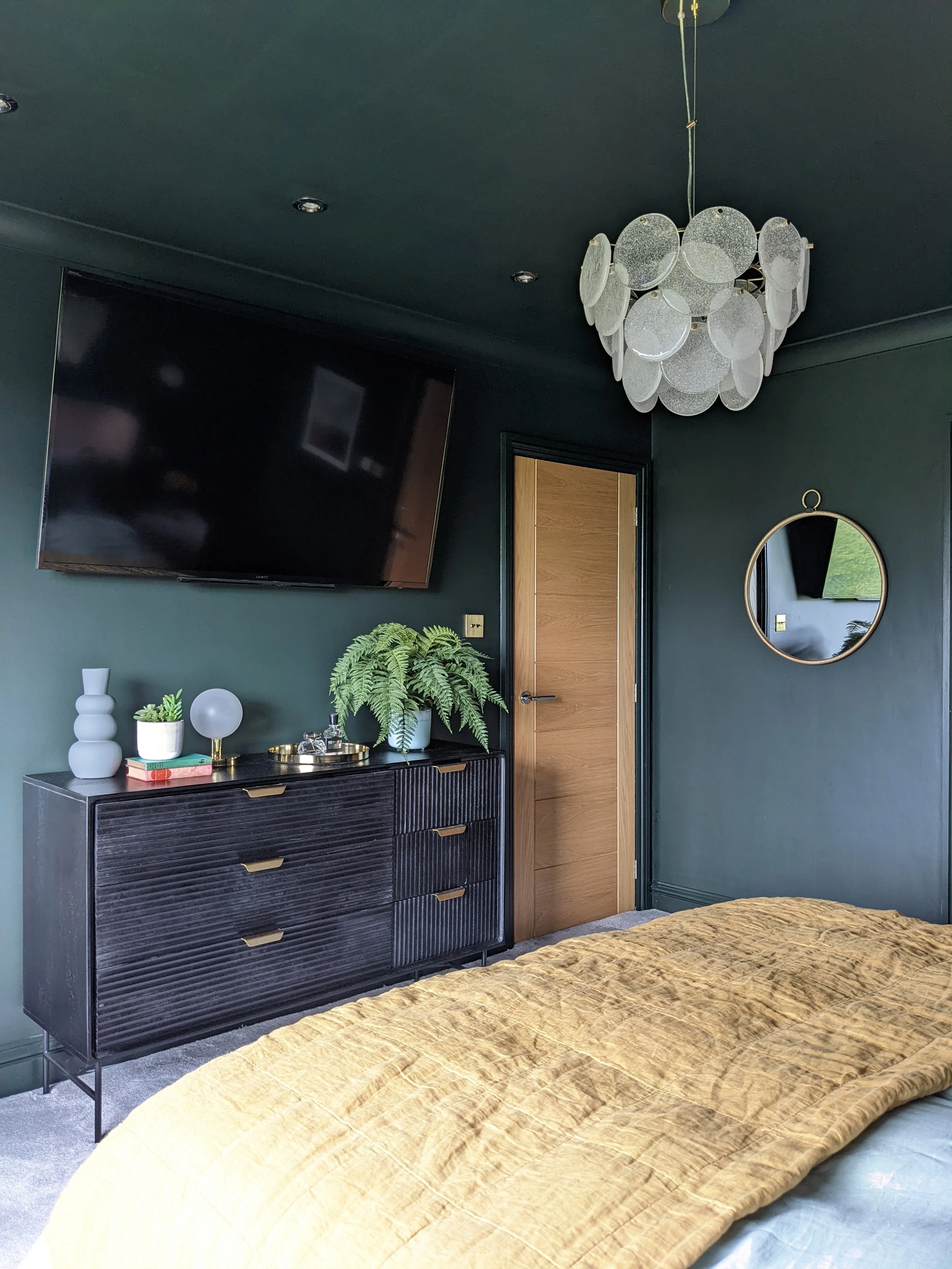
Set against a dark wall, the TV is now much less prominent. The lovely chest of drawers from Made adds more moody texture to the space.
After
The door to the left of the chest of drawers is a walk-in wardrobe so clothes storage didn’t need to be factored into the bedroom design.
Before
After
Although the original plan was to include curtains for softness, I decided to keep the window treatment as simple as possible with a black-out roller blind so as not to detract from the outside. Who wouldn’t love a view like that?!
Before
After
The beautiful pendant light is from houseof and it really stands out against the dark walls and ceiling. The circular disks tie in with the shape of the wall lights and add softness to the space.
I sourced the bedside tables from Atkin and Thyme. They’re made from mango wood and the detailing echoes the pattern of the panelling.
I absolutely love this room - it’s got such a cosy feel and the clients say they’ve never slept as well!
What do you think? Let me know in the comments.
I’m a Halifax based interior designer and I cover surrounding areas, including Leeds and Manchester. I also provide a remote design service. If you’re starting a project and need some help or inspiration, please get in touch.

