Light Blue Bedroom Design - How we Created a Cosy Space
While dark blues are great for making a bedroom feel cocooning, light blue shades are the perfect choice if you want to create a calming and serene atmosphere. Today, I'm showing you the final reveal of a beautiful master bedroom design that I worked on for my clients in Boston Spa. If not designed carefully, a light blue room can risk looking cold and sterile, so I’m sharing plenty of interior design tips on how to make sure it has a warm and inviting feel.
Interior Design Scheme
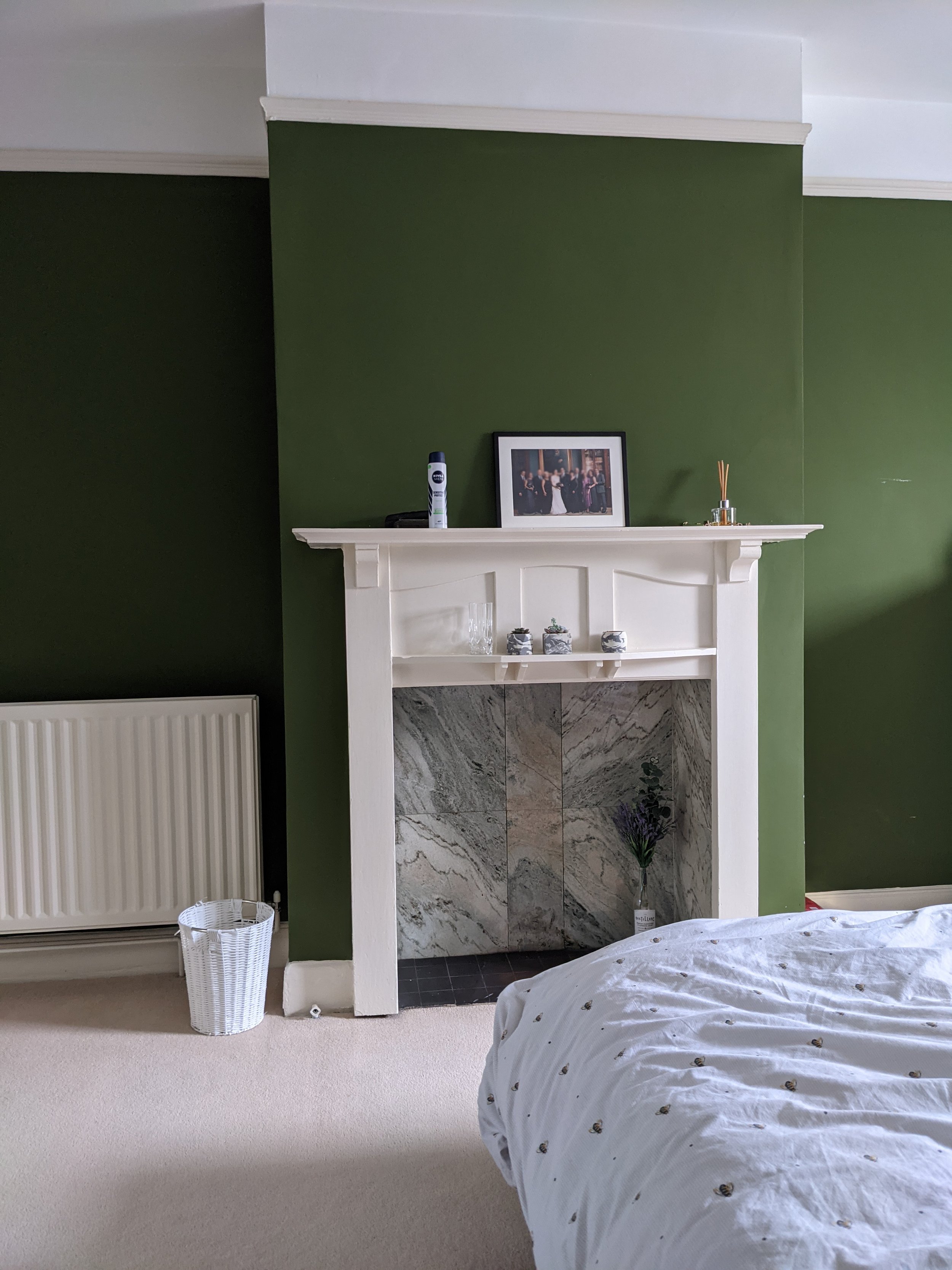
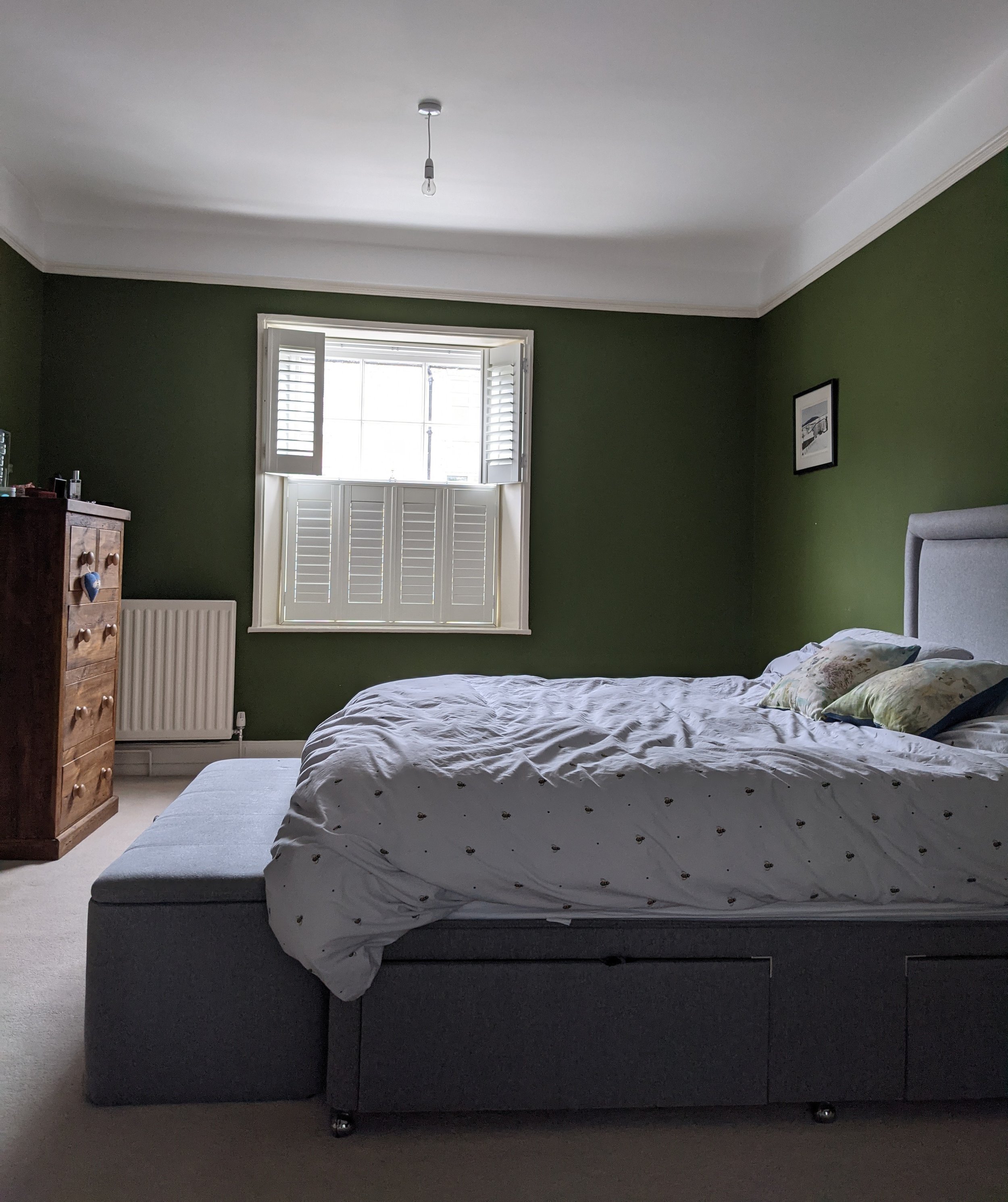
Before
While I'm a big fan of green walls, and we used a dark green in this house's home office, it felt far too heavy and oppressive here. The clients were really keen for their bedroom to become a light and airy space with a cosy, relaxing feel so as part of the design process, we decided on a light blue colour scheme.
Design board
The layout
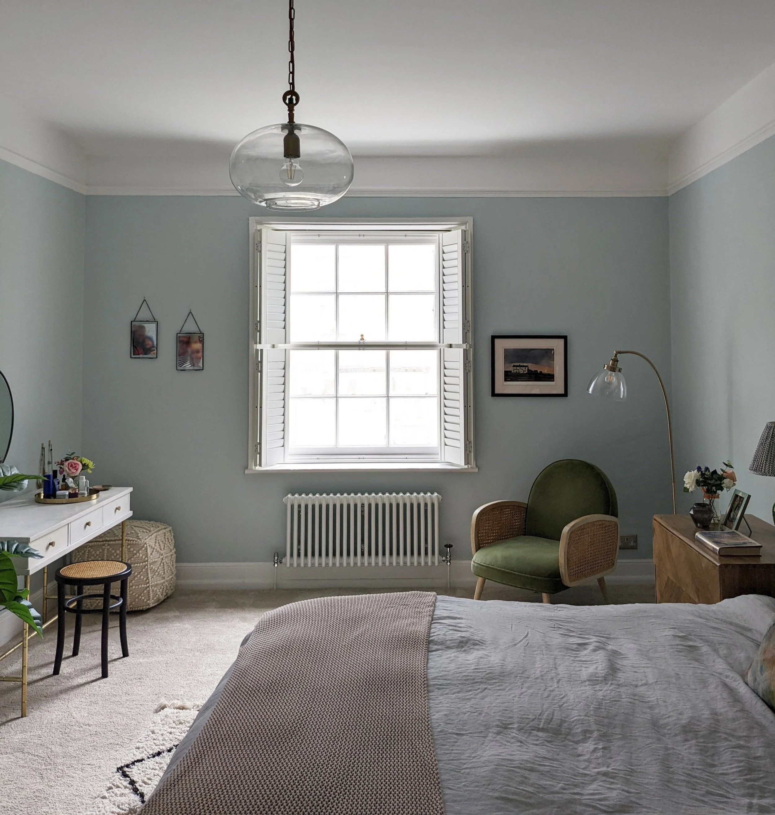
This is a large bedroom but the original location of the three radiators meant that a lot of wall space was unusable. We removed one of the radiators and relocated another to under the window, which is often the recommended position in rooms with single glazing.
The adjoining room is a dressing room with lots of wardrobe space but I suggested chests of drawers either side of the bed for extra clothes storage. I also recommended adding a dressing table to the right hand alcove.
And now here are some before and afters with my interior design advice on how to use pale blue paint to create a cosy and calm feel in a bedroom!
Choose the right light blue shade for your space
Before
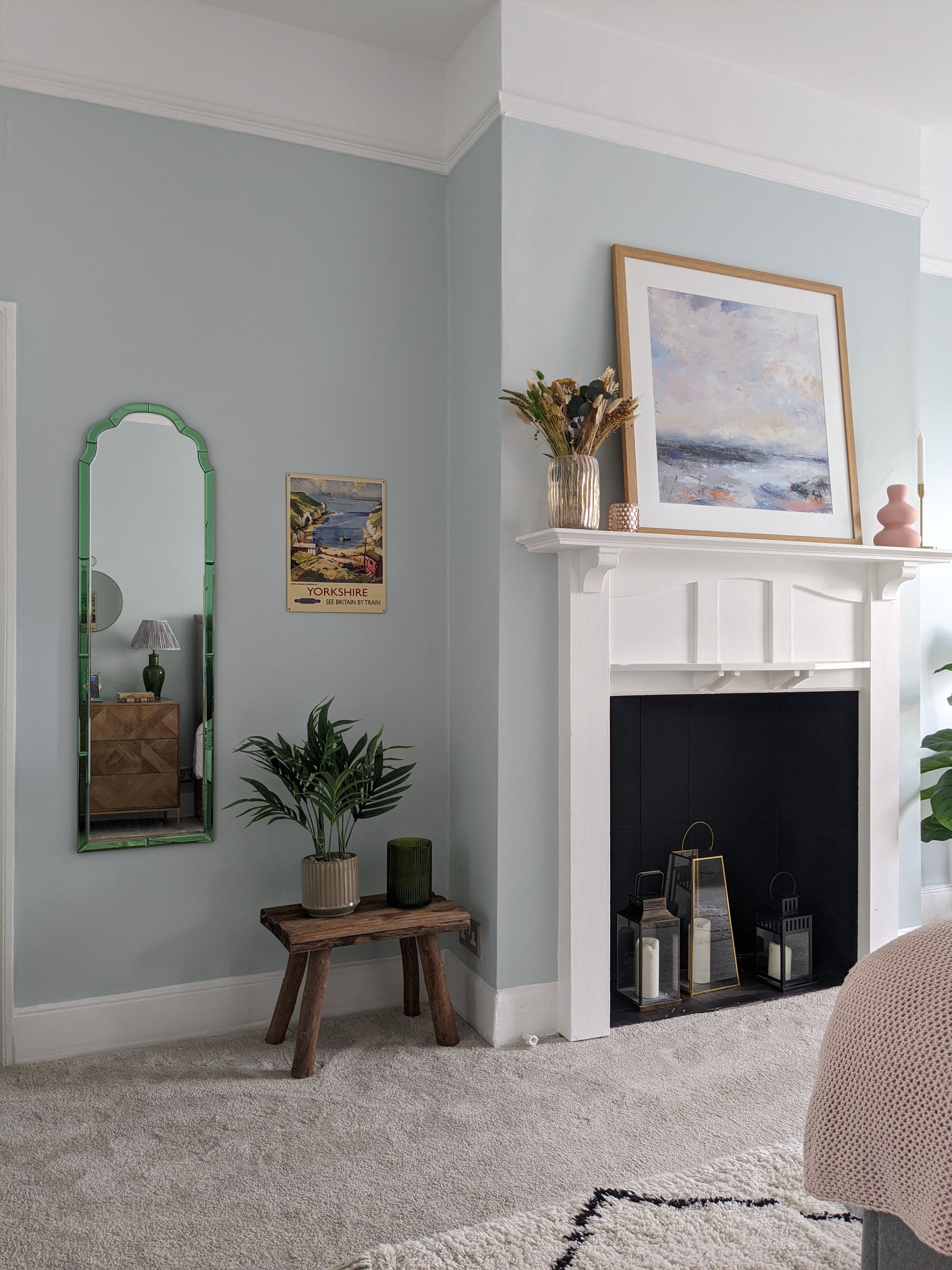
After
It's really important to consider the orientation of the space when deciding on a light blue paint colour. Although this room doesn't get lots of natural light because it's blocked by the houses opposite, it is south facing so the light that it does get is warm. I always recommend painting samples on big pieces of lining paper and moving them around the room to see how they look in different lights. We tried a few different shades before deciding on Glass Slipper by Benjamin Moore - a lovely, delicate powder blue. It's like a breath of fresh air! In north facing rooms, choose a light blue wall paint with warm undertones. Little Greene's Celestial Blue, a dusky sky blue, works brilliantly.
2. Incorporate black
Before
After
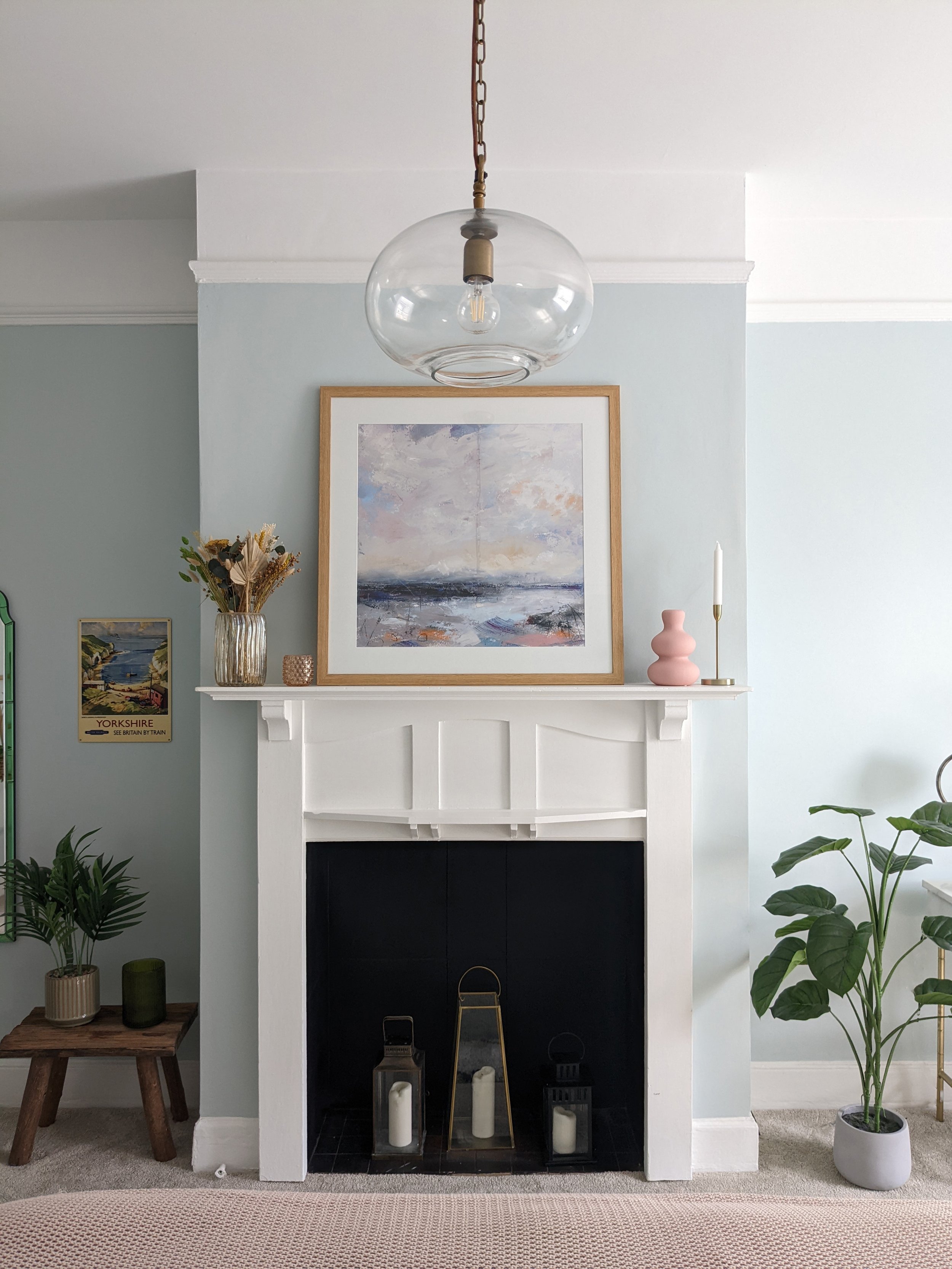
I usually recommend incorporating a bit of black in most room designs but it's especially important in a pastel coloured room because it prevents it from looking washed out. As well as painting the fireplace tiles in Annie Sloan black chalk paint to match the hearth, we also added black in the picture frames on the opposite wall which has helped to ground the space.
3. Add pink and green accents
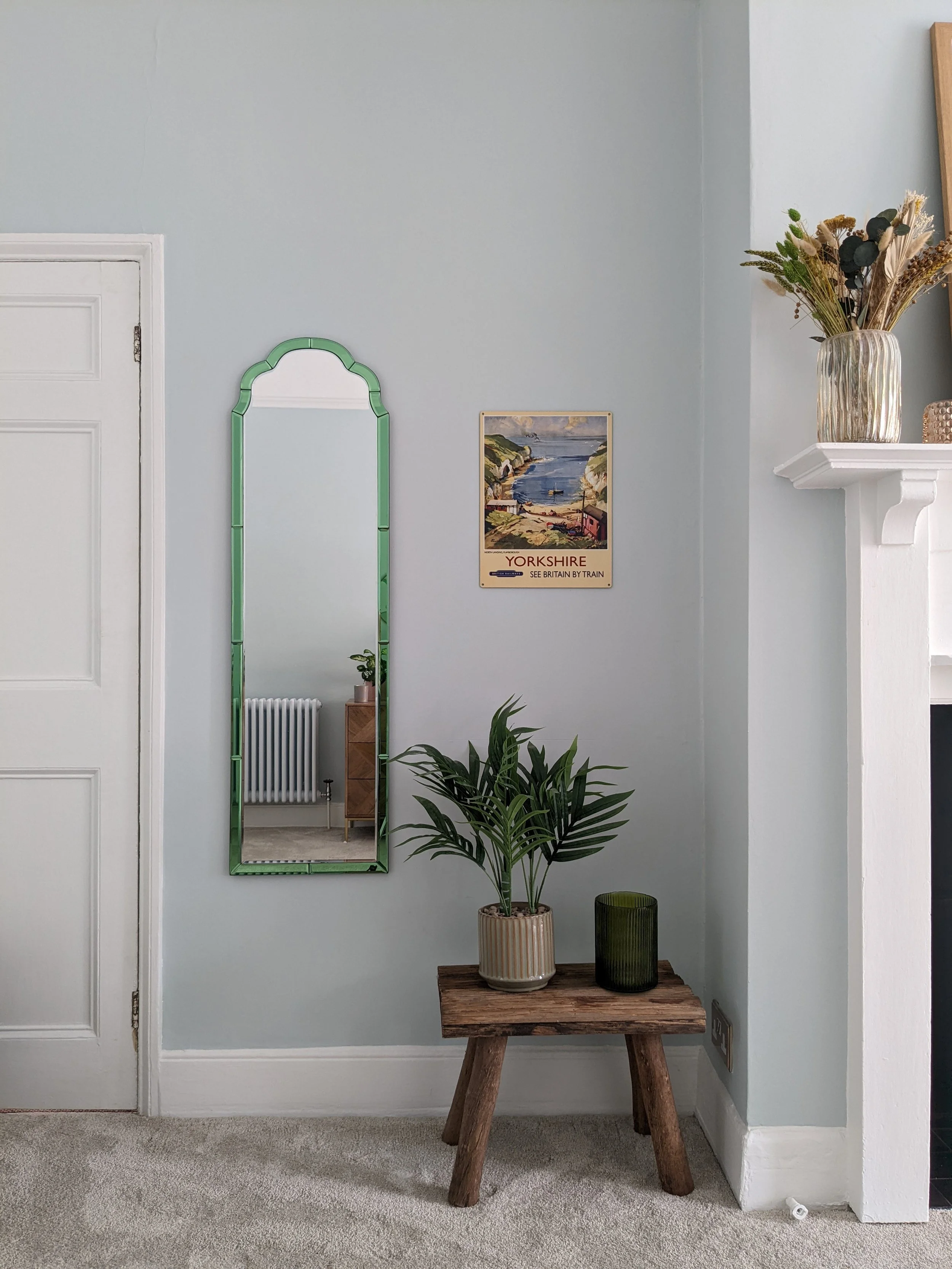
Green and blue is one of my favourite colour pairings. We introduced soft greens for a calming feel, and deeper olive green shades to add depth.
Coming from opposite sides of the colour wheel, pale pink and light blue is the perfect combination for a calming bedroom, providing a lovely soft balance between warm and cool hues (think sunset skies). We introduced soft pink hues as accents throughout the room - in the bed throw, wall prints and decorative accessories.
We also painted the adjoining north facing dressing room in pale pink for a beautiful contrast.
Dressing room - Before
Dressing room - After
In north facing spaces, pinks have a tendency to look lilac so it took a few tries to find the perfect shade. Threadneedle by Mylands is now one of my go-to pink paint shades - it works in rooms of all orientations but looks much warmer and peachier in south facing rooms. Here, it works perfectly with the blue to create a soft and dreamy look.
See the lovely soft contrast between the pink and blue?!
4. Include natural elements
Before
After
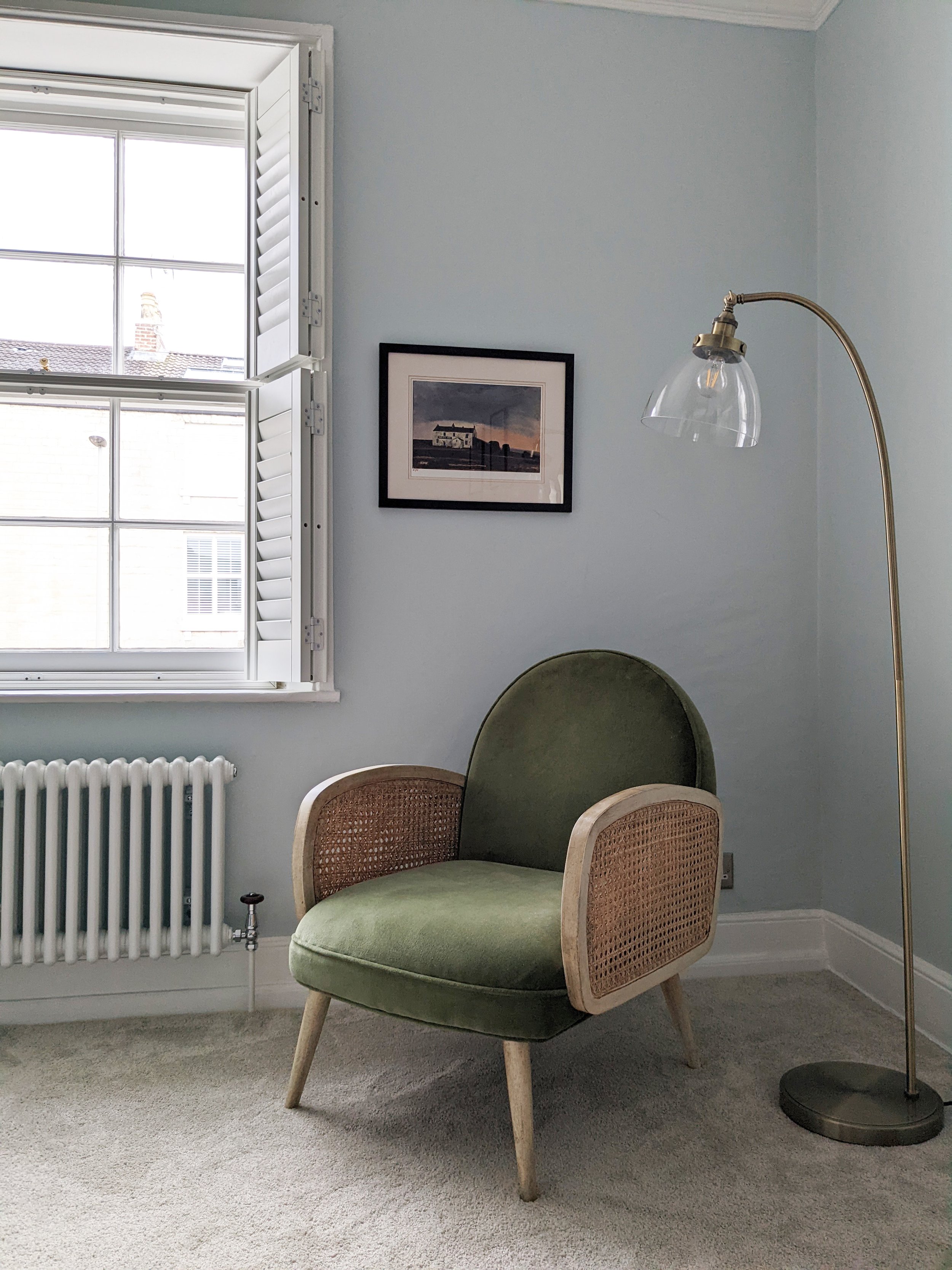
It's also important to include natural materials like wood or rattan furniture and linen bedding. As well as providing a warm contrast with the cool tones, natural textures help to create a cosy, inviting feel. Rather than sticking to one wood tone, using a mixture helps to create a more layered, relaxed look.
Such a relaxing reading corner. I'm a little bit jealous of the Atkin and Thyme Emmeline armchair with its curved art deco shape! The rattan texture and rounded arms add so much warmth and softness to this corner.
5. Introduce gold tones
Just as wood warms things up, using brass and gold accents is a great way of elevating the space, bringing richness and balance. We chose antique brass tones to suit the traditional era of the house. The whitewashed mango wood dressing table from Atkin and Thyme has a lovely subtle scallop detail on the top.
6. Use glass light fixtures
Including glass accents adds elegance, lightness, and a sense of openness because it reflects natural and artificial light. This works beautifully with light blue, enhancing the fresh and serene mood.
Whereas lightshades made from wood or metal would have felt heavy, the glass here feels really delicate and complements the softness of the light blue without overpowering it.
7. Opt for a warm coloured carpet
Warm coloured flooring balances the coolness of the pastel blue walls, bringing a sense of cosiness to the space. We chose a deep pile design to enhance the inviting feel.
The pretty full length mirror is the Aurora from Oliver Bonas.
Cormar Carpets is my go to supplier for deep pile carpets and a lot of them are bleach cleanable, making them a really practical option for kids' rooms too!
So there you go! This bedroom feels so much more tranquil now - the perfect place to relax after a busy day. I hope this blog post has given you lots of blue bedroom ideas for your own project!
Click here to see this house’s amazing kitchen-diner transformation.
I’m a Halifax based interior designer and I cover surrounding areas, including Leeds and Manchester. I also provide online interior design services. If you’re starting a project and need some help or inspiration, please get in touch.


