Interior Paint Colour Trends for 2025
For the latest inspiration, click here to read my interior paint colour trends for 2026.
Image credit: Benjamin Moore UK
Happy new year! For my first blog post of 2025, I'm looking at paint colour trends for the coming year. While I never recommend choosing colours solely based on trends, I often find that my interior design clients’ likes and dislikes are influenced by the colours of the moment.
Over the last few years, we've seen a significant shift away from grey towards warmer, earthy tones and this is definitely set to continue into the new year. The paint companies' colour of the year selections include a wide variety of hues but there's a common theme and that's the desire for warmth, comfort and optimism.
Whether you're after a calming sanctuary or a burst of energy, you're sure to find the perfect colour in this roundup of paint trends.
Brown
Brown is definitely having a moment in home interiors. From deep chocolate tones to truffle browns and caramel shades, brown brings warmth and grounding to interiors, echoing the richness of natural materials like soil, wood and stone.
Image credit: Pantone Mocha Mousse
Pantone's colour of the year, Mocha Mousse, is an earthy brown with pink undertones which they describe as a warming brown hue that "nurtures us with its suggestion of the delectable qualities of chocolate and coffee, answering our desire for comfort." It has received mixed reactions in the world of interiors and on paper I'm not a big fan of brown but I think this shade is so warm and inviting, maybe because it reminds me of Cadbury's chocolate mousse dessert.
Image credit: Graham & Brown Elderton & Honey Pot
Graham & Brown have also chosen a deep brown as their colour of the year. Elderton is described as "the symbiosis of the man-made and the natural world". It's a warm dark brown that takes its name from the humble elder tree. Colour drench the entire room for a cocooning feel or pair with a lighter warm neutral like Honey Pot for contrast. Their design of the year - Rivington Folly - is the perfect pairing if you're looking for a complementary wallpaper or fabric.
Image credit: Graham & Brown Rivington Folly Dusk wallpaper with Elderton on woodwork
Although brown has gained popularity in interiors over the last few years as a paint colour in its own right, we're now seeing it creep into other colours, creating "muddy" shades that feel more muted.
Purple
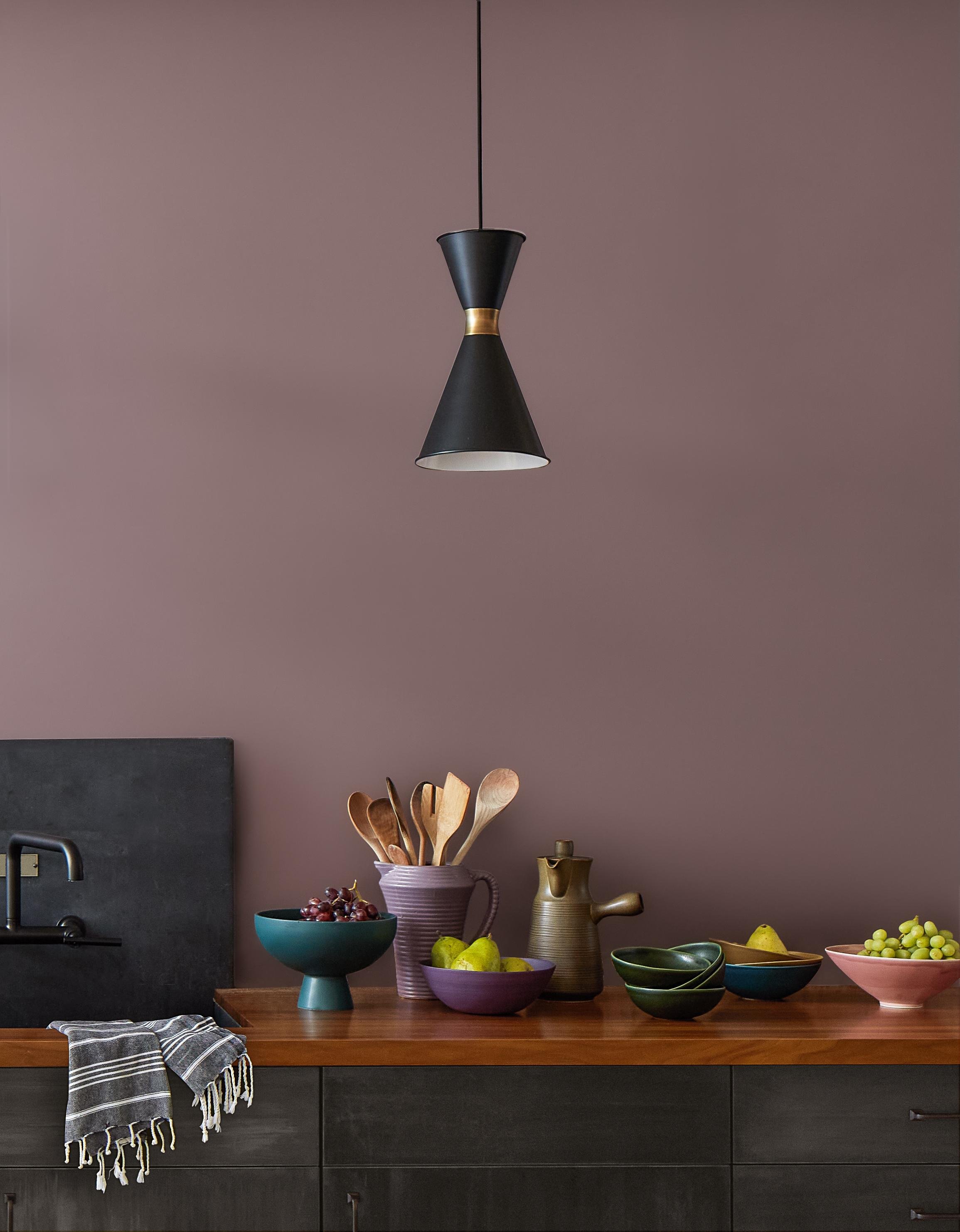
Image credit: Benjamin Moore Cinnamon Slate 2113 40
Benjamin Moore's colour of the year, Cinnamon Slate, is described as "A delicate mix of heathered plum and velvety brown". It features in their colour trends palette for this year alongside other bold colours that don't feel too bright or saturated. I particularly love the combination of Cinnamon Slate and Rosepine - a deep forest green.
Rich Green
Image credit: Benjamin Moore Rosepine 461, Ashwood Moss 1484
Rich green will continue to be popular in 2025, with forest and olive greens taking centre stage. Jewel colours like emerald will also be widely used as accents for a bold, luxurious look.
Deep red
Image credit: Earthborn Ladybug
Just as burgundy has take centre stage in the world of fashion, it's now making a bold statement in interiors, exuding richness and sophistication. Use on walls as part of a deep bold palette for a dramatic look or keep walls neutral for a lighter feel, highlighting woodwork or furniture in a deep burgundy.
Image credit: Benjamin Moore New London Burgundy
Warm pink
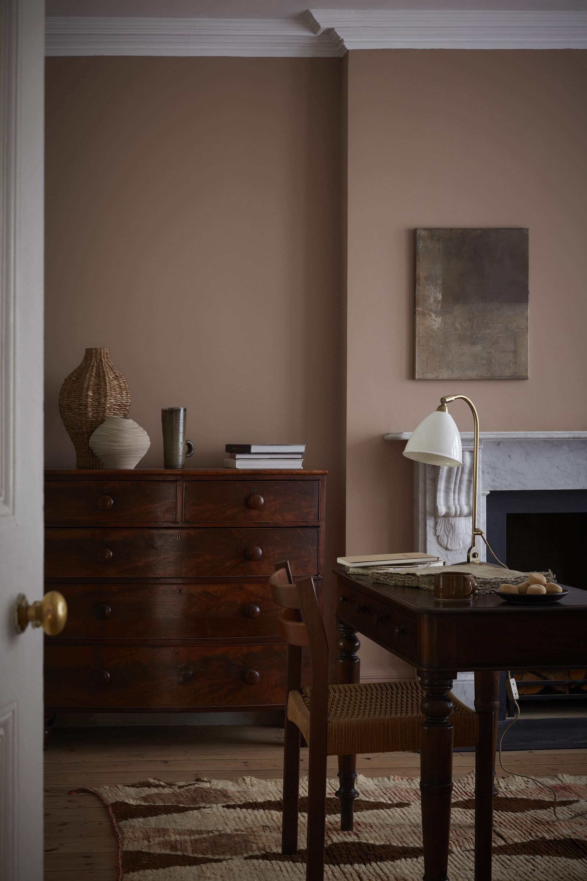
Forget the millennial pink of yesteryear - this year’s pinks have peachy or brownish tones. Part of Little Greene's Sweet Treats collection, which is fast becoming one of my favourite colour palettes, Mochi has been chosen as the paint brand's pick for this year. It's a beautiful pink brown that's both deep and muted with a lovely softness that works well in all kinds of spaces, from home offices and dining rooms to bedrooms.
Image credit: Little Greene Mochi
Pink based neutrals look great in all lights and create a sense of warmth. Inspired by the stonework in North Wales's Penrhyn Castle, Little Greene's Castell Pink is a lovely plaster colour which I've used in both north and south facing spaces, like in this north facing Edwardian hallway.
Edwardian hallway painted in Little Greene’s Castell Pink
Bright yellow
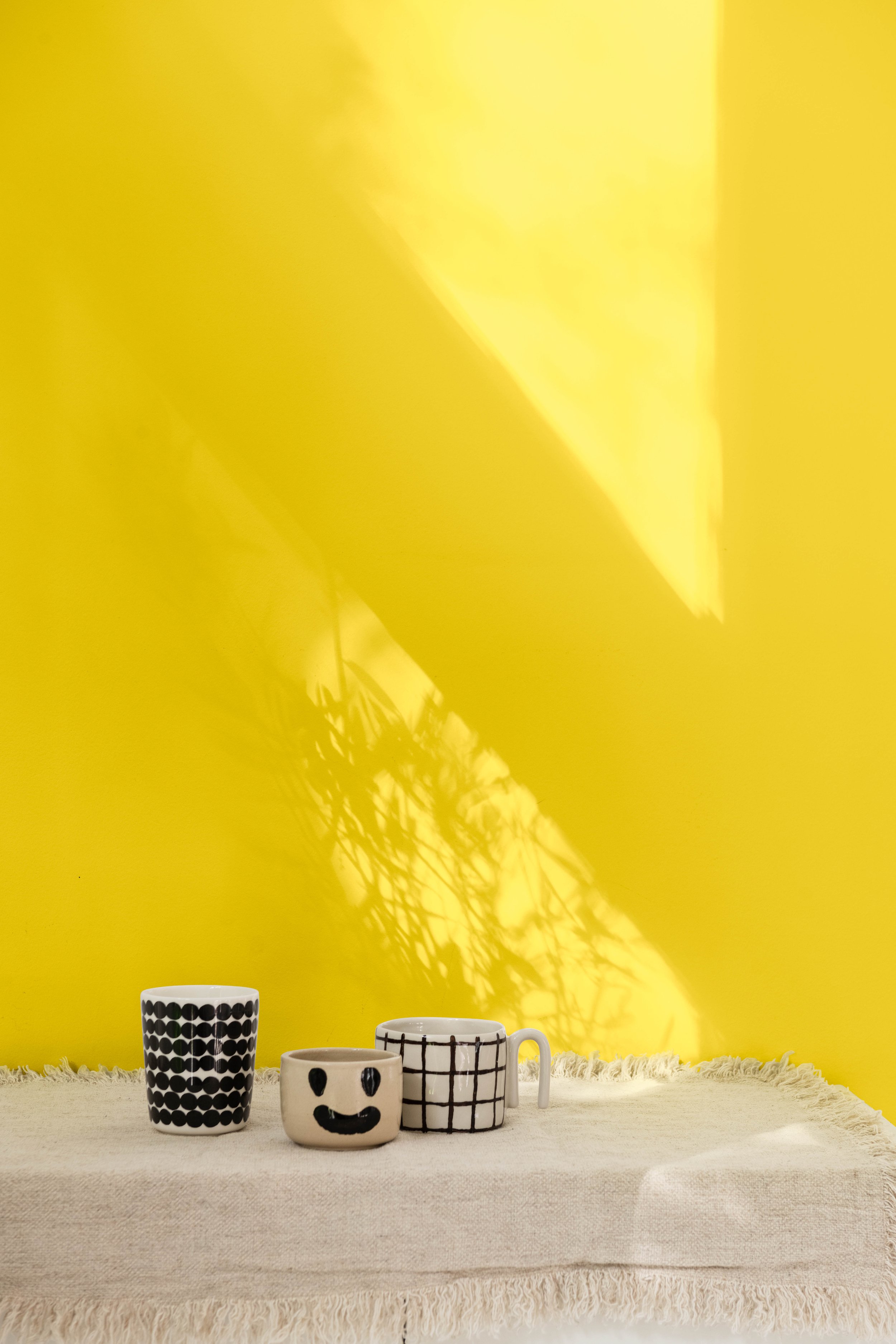
Image credit: Dulux True Joy
Continuing with the warm hues, Dulux's colour of the year is True Joy, a bright yellow that epitomises optimism and energy. They have come up with three different colour collections (the Bold, Proud and Human palettes) that work beautifully with True Joy, whether you're looking for an energetic and lively feel; something warm and cosy; or a more muted, neutral scheme.
Yellow tones are the perfect choice for creating a happy, uplifting feel but if like me you find them a little overbearing, try adding smaller doses of yellow as accents. It works brilliantly as a pop of colour on a window frame or as a fun way of visually separating two spaces.
No Space Like Home Coastal Kitchen Diner. with the opening painted in Little Greene’s Mister David
Dusky Blue
Light dusky blue offers a fresh and airy alternative for those looking to shift away from warmer hues and deep bold palettes towards a lighter, more tranquil aesthetic.
Image credit: Little Greene Celestial Blue
In a north facing room, opt for a light blue with a hint of green to stop it feeling cold. I chose Little Greene's Celestial Blue for my new studio which is north facing. It has the perfect balance of blue, green and grey for a really soothing feel (room reveal coming soon!)
So what do you think? Seen anything you love? Let me know in the comments! And if you need any help with choosing the perfect colours for your space, do get in touch.


