
The Best Paint Colours for a North Facing Room

I’ve spoken before about how north facing rooms are the trickiest ones to get right from a colour perspective. In this post, I'm sharing specific paint colours from the best paint brands that work brilliantly in north facing spaces, whether you're looking for a neutral paint colour, a dark or something a bit brighter. I recommend reading this blog post first which is all about how to choose paint colours for your home.
Why are north facing rooms difficult to deal with?
Rooms with a northern exposure don't get a lot of natural light and the light that they do get is much cooler. This means that whichever colours you choose will look cooler and bluer. A lot of people think that brilliant white is the best way to brighten up a north facing room but because there's no light and shadow to bring things to life, it can actually have the opposite effect - creating a dull, flat space. In fact, I usually recommend embracing the northern light and painting the room in a darker colour. There are lots of options though and there aren't really any colours that I would stay away from - it's just really important that you choose the right paint shade, generally one with a warm undertone, to avoid it feeling cold.
Neutrals
For a north-facing room, warm neutrals with yellow, beige, or red undertones work best to counteract the cooler natural light.

Swiss Coffee (Benjamin Moore) - A soft off-white with a subtle warmth. Drench walls, ceiling and woodwork for a light, welcoming feel.

Boy’s bedroom painted in Swiss Coffee
Stock (Little Greene) - creamier than Swiss Coffee, this soft pastel white has a yellow base so it really warms up a north facing room.

Dining room painted in Stock
Portland Stone family (Little Greene) - Portland Stone is a grey based neutral and sits somewhere between grey and beige with just the right amount of warmth. It comes in a family of four different shades ranging from Pale to Dark.
Playroom painted in Portland Stone.
French Grey family (Little Greene) - A definite grey but warm enough to be used in a north facing space, a collection of four shades makes up the French Grey family.

Cloakroom at the North Wales coastal home with French Grey on the panelling.

Our dining room with north and east facing windows with French Grey Mid on walls and French Grey Pale on woodwork.
Blues
In a north-facing room, warmer blues with green undertones work best, as they prevent the space from feeling too cold and create a calming feel.

Atmospheric (Benjamin Moore) - A really soothing colour, this light blue has a hint of green which helps to counteract the cool north facing light.

Hallway painted in Atmospheric with woodwork in Knoxville Gray
Celestial Blue (Little Greene) - This dusky light blue is slightly lighter than Atmospheric and has a lovely soft look.

Image credit: Little Greene Celestial Blue
Marine Blue (Little Greene) - a strong deep teal that feels lovely and warm. It pairs beautifully with Celestial Blue (as in the picture above).

Hallway painted in Little Greene’s Marine Blue and Slaked Lime
Hague Blue (Farrow & Ball) - choose this deep dark blue for a dramatic look. The green undertones balance the cool, muted light in a north facing room, creating an inviting feel.
Greens
For a north-facing room, warmer greens with yellow or earthy undertones generally work best to counteract the cool light. Shades like sage, olive, and moss green create a cosy and inviting atmosphere while still feeling fresh and natural. If you’d rather a cooler green, just make sure that the blue in it isn’t too strong for the room.
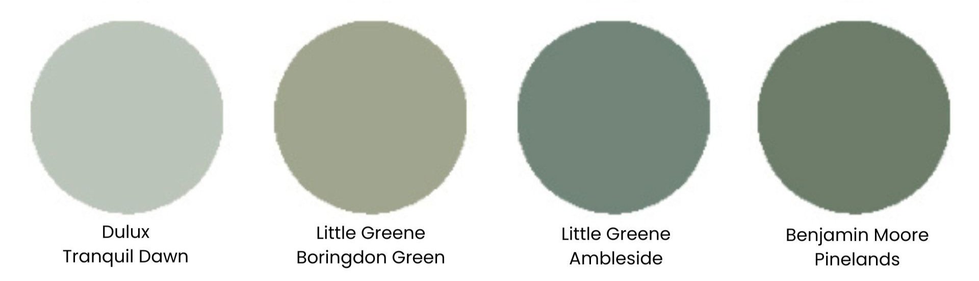
Tranquil Dawn (Dulux) - a soft misty green with subtle grey undertones - the colour of a morning sky - this shade has a really calming feel and looks beautiful with soft pink accents.

Coastal bedroom painted in Dulux Tranquil Dawn with an ombre wall in Denim Drift
Boringdon Green (Little Greene) - if you’re after a warm light green, stay away from shades with a blue base because they’ll end up looking minty. Boringdon Green is the perfect muted shade.

Bespoke kitchen painted in Little Greene’s Boringdon Green
Ambleside (Little Greene) - Inspired by the colour in Beatrix Potter’s bedroom, this deep green has a muted blue undertone so it’s a great choice if you’re after a cool dark shade that doesn’t feel too blue.
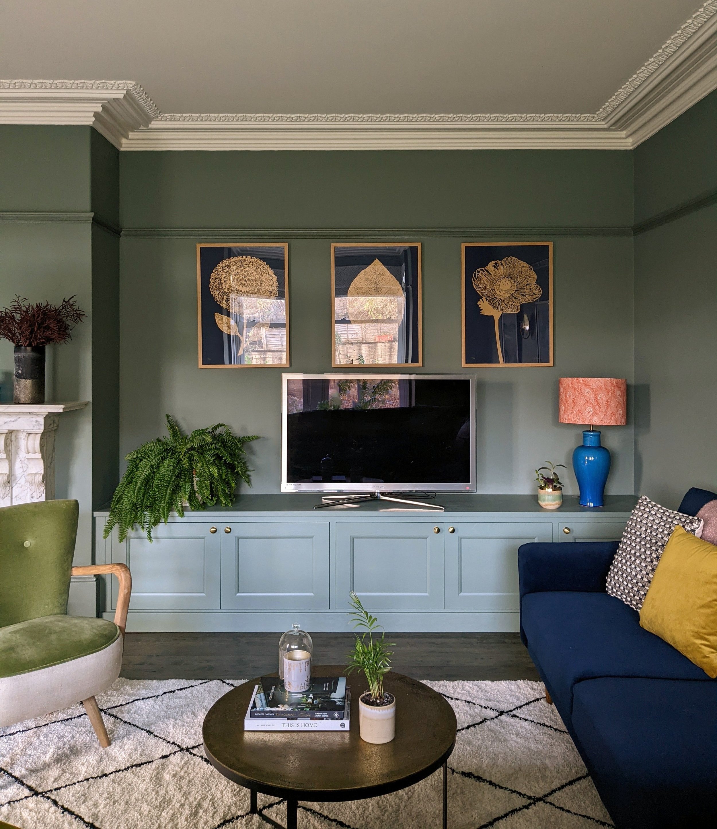
Georgian living room painted in Ambleside. I originally tried Little Greene’s Pleat in this client’s north facing lounge and it looked far too blue so I switched to this and it’s the perfect colour for the space.
Pinelands (Benjamin Moore) - a lovely forest green shade that’s warmer than Ambleside.
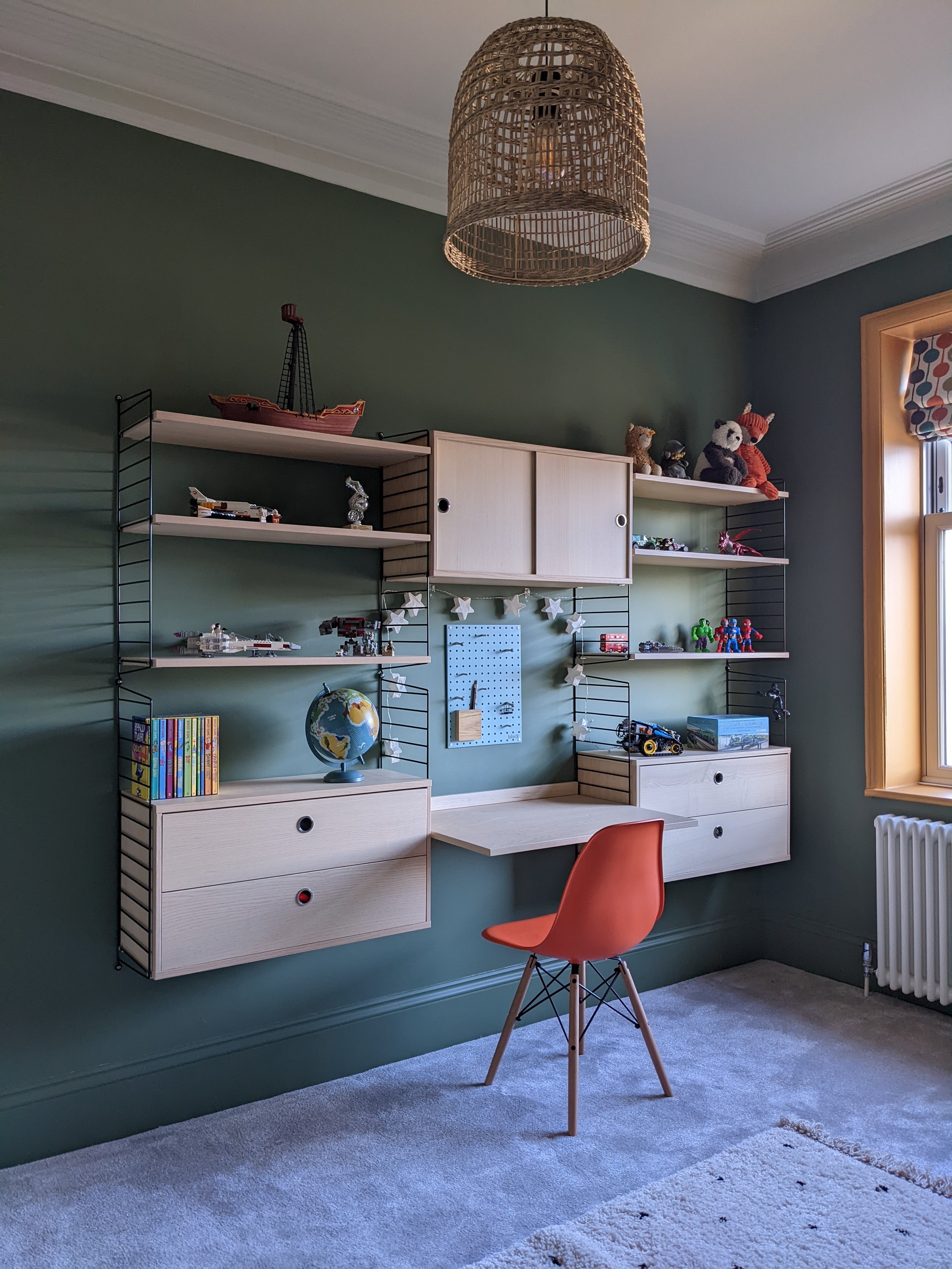
Boys’s bedroom painted in Pinelands.
Best pinks and reds
While pink is the colour that’s the most difficult to get right in a north facing room, if you choose the perfect shade, pinks and reds work brilliantly to counteract the cool light. Just make sure that you go for a warm shade with peach, coral, or terracotta undertones.

I did a colour consultation for a client's Edwardian hallway a while ago. She wanted a warm feel so we decided to go pink on the walls. We sat in her kitchen looking at some warm pinks on the paint chart but when we transported them through to the north facing hallway, they all looked lilac! I could open a pink paint shop with the amount of samples we got through but we eventually found the perfect shade and that was…
Castell Pink (Little Greene) - my favourite plaster shade for north facing spaces, this soft pink instantly adds warmth. It looks great paired with brighter colours as accents.


Threadneedle (Mylands) - a beautiful delicate pink shade with a hint of orange and umber that prevents it from turning lilac in a north facing room.

Dressing room painted in Threadneedle
Baked (Coat paints) - my favourite terracotta paint colour, this is a soft deep shade with a hint of grey. A lovely warm colour that doesn’t feel too bright.

A recent design board I created for a north facing living room with walls painted in Baked.
Nether Red (Little Greene) - A mud red shade with a soft muted feel. I love this colour paired with Celestial Blue as an accent.

Image credit: Little Greene Nether Red
Yellows
For a north-facing room, warm, rich yellows with golden or ochre undertones work best to counteract the cool light. Stay away from greener shades.

Golden Straw (Benjamin Moore) - a subtle, pale yellow with warm cream and peach undertones.

Image credit: Benjamin Moore Golden Straw
Yellow-Pink (Little Greene) - a rich, earthy mustard with a hint of red providing lots of warmth. It works especially well with woodwork highlighted in a darker colour like Harley Green or Lamp Black.

Image credit: Little Greene Yellow Pink
And just a couple more very important tips:
As always, make sure that you try a sample in the space. Paint it on to a piece of lining paper (at least size A3) and see how it looks in different areas of the room at varying times of day and in artificial light.
If you opt for a cool colour like blue, green or grey on the walls, make sure that you add warm accents to bring the space to life.
I’m a West Yorkshire based interior designer and I provide online design services throughout the UK. If you’re starting a project and would like some help, I’d love to hear from you! Take a look at my online interior design packages and get in touch if you’d like to book a free introductory call.