New Build Kitchen-Diner Reveal - How to Get a Low Cost Refresh
I'm excited to share the final reveal of the kitchen-diner at my new build project! I’ve been working with these clients for a few years and we've transformed the whole house using affordable interior design ideas. I've already shared some of the room reveals with you, including how we made the living room feel welcoming and cosy. Today, I'll be sharing tips on how to work with an existing new build kitchen, with quick and easy ways to transform it at a reasonable cost.
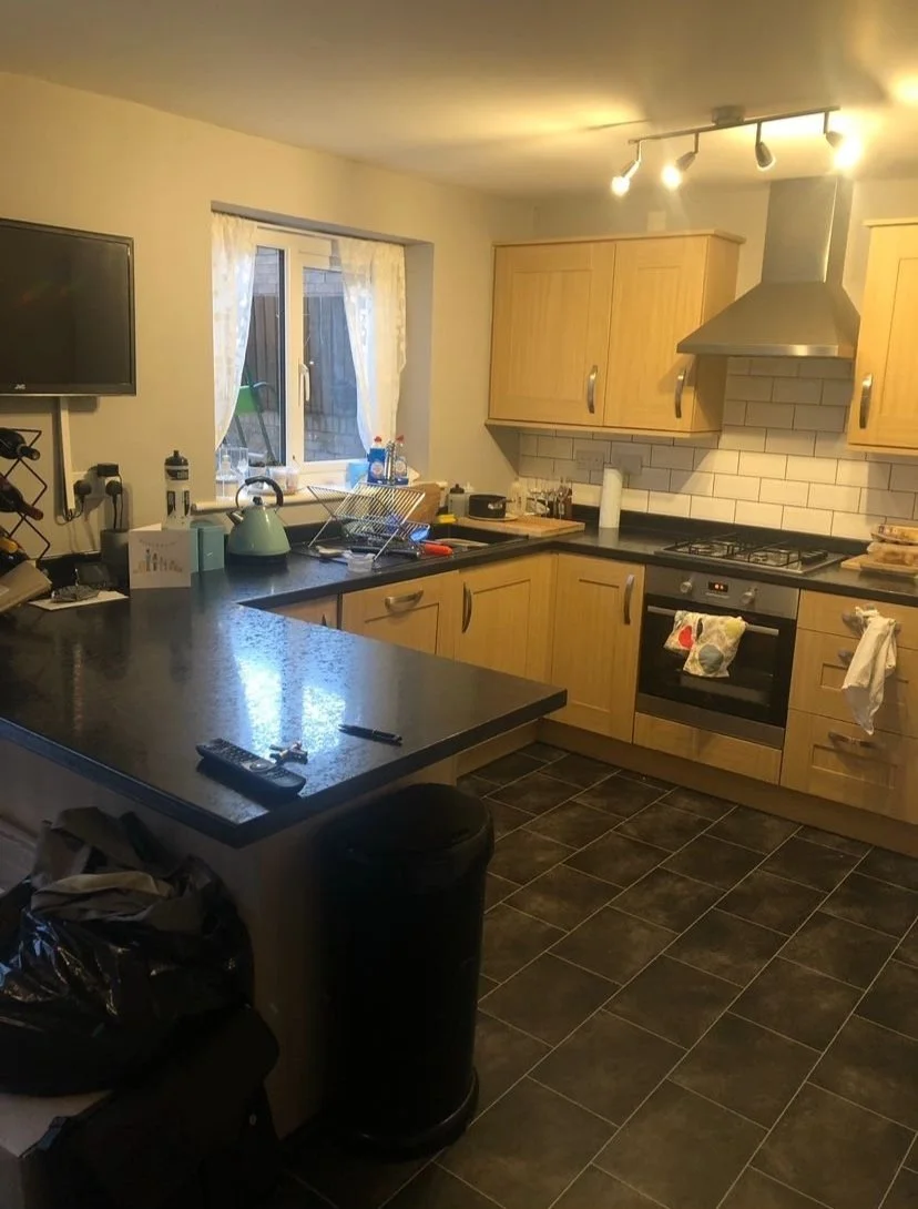
Before
One of the benefits of living in a new build house is that the layouts are practical for modern family living. This house was built eight years before the clients moved in and the kitchen-diner layout worked for the family of four but it still had its original decor and kitchen cabinets so it was looking dull and tired. Double doors lead out on to the back garden and because this is the room where they spend most of their time, the clients wanted it to feel like an inviting, comfortable, sociable space.
Here are my tips on how to refresh a new build kitchen without breaking the bank.
Paint the Kitchen Cabinets
After
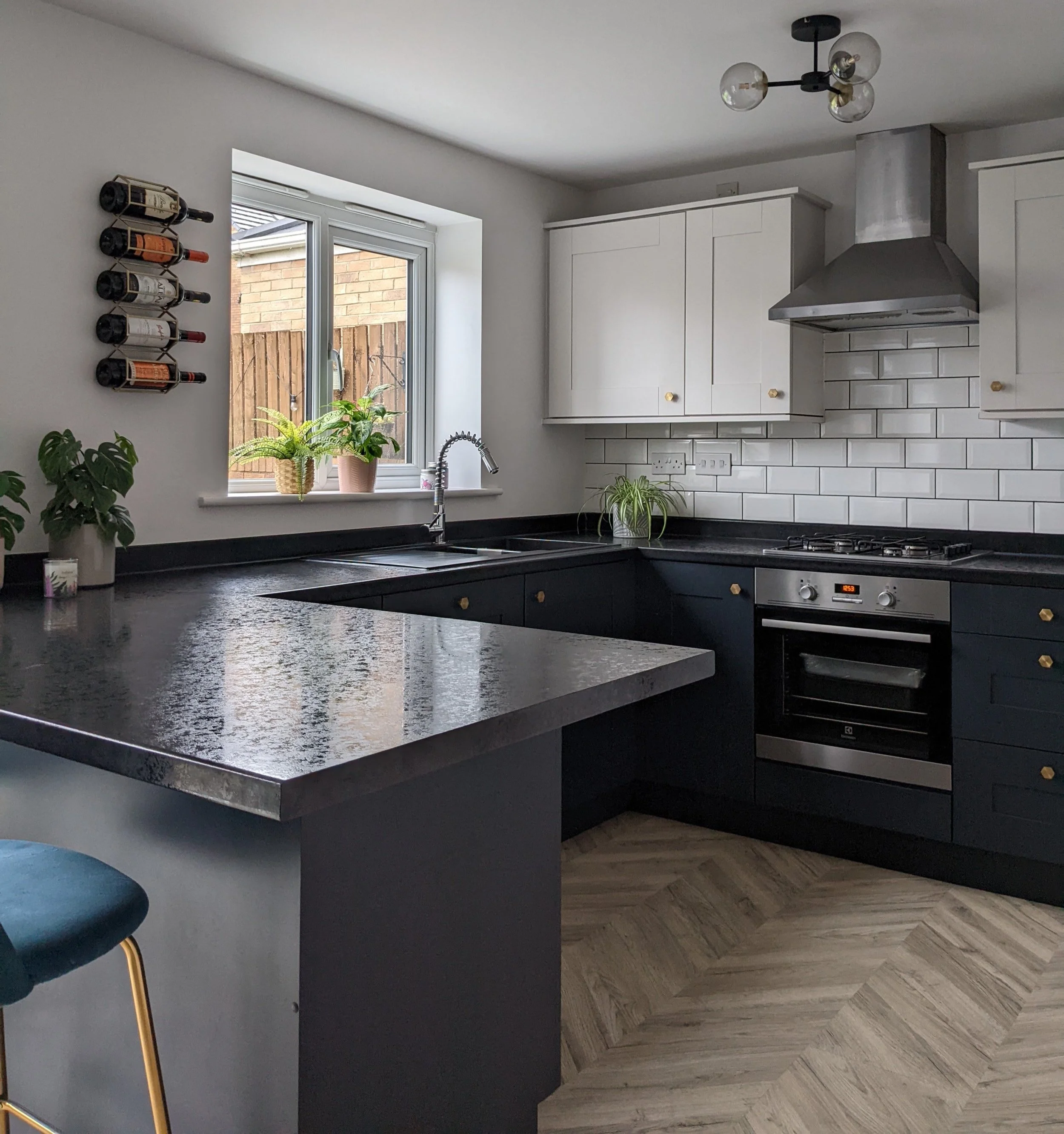
If you've moved into a new-ish house and you've inherited the kitchen that was installed by the builders, the units and appliances are likely to be in good condition so you might not need a full kitchen renovation. Instead of having new cabinets or new cabinet doors and drawer fronts installed, painting the current cabinets is a great way of getting a new look on a budget. Although it's possible to hand paint old cabinets, the finish is usually more durable if you have them sprayed so we brought a specialist spray company in for this project. The cost of having a kitchen sprayed obviously depends on the size of your kitchen and the number of cabinets but this one cost £650, including the units in the adjoining utility room. Much cheaper than replacing the units or having new doors installed!
The base units are painted in Railings by Farrow and Ball and the wall units are in Ammonite. Painting the wall units in a similar colour to the walls makes the room feel lighter.
It's possible to spray all kinds of kitchen units, from ones with solid wood doors and wood veneer to plastic laminate or even high gloss. Spray companies carefully cover any items that are staying, like worktops and splashbacks, so they're usually able to work in-situ without needing to take the units away.
2. Get new hardware and accessories
Before
After
Another easy update for a fresh look is to replace the existing cabinet handles. We chose contemporary hexagon knobs in a gold finish from the Hairpin Leg Company to add warmth and give the space a lift. The old handles were removed so that the holes could be filled before spraying, and the new knobs were fitted afterwards.
The clients were keen to incorporate wine storage in their kitchen but because we were keeping the existing units and layout, we couldn't add an integrated wine rack. Instead, I sourced these wall wine racks from Oliver Bonas. They're in a hexagon shape and they're gold coloured too so they tie in with the new cabinet knobs perfectly. Space-saving storage accessories are great for a family kitchen, especially when space is limited.
3. Zone the dining area with paint
Before
After
Using paint is one of the most affordable ways to give your space a new feel. We kept the paint colour in the kitchen area neutral (a colour match of Strong White by Farrow and Ball), but we colour blocked the dining area in the darker Hague Blue, wrapping it around all three walls to make it feel more cocooning. Having a dark wall here also makes the wall prints stand out. The gallery wall adds loads of personality to this room and the contrasting accent colours bring the dining area to life. I love the pink personalised typography print from Gayle Mansfield Designs.
4. Change the lighting
As this was an affordable refresh, the clients didn't want to go to the hassle and expense of moving the lights so we kept them in their current locations and changed the light fittings to more contemporary ones. Where budget allows, under-cabinet lighting and pendant lights above a dining table or peninsula are great for adding task lighting to kitchen-diners.
5. Invest in new dining furniture
In a new build house, I recommend sticking with contemporary or mid-century shaped furniture. I sourced a new dining table which has a simple, mid-century shape and we chose mismatched chairs for a laid back look. I made sure that the spots where the kids sit have wipeable chairs for practical reasons! We also introduced comfy velvet stools for the breakfast bar.
6. Replace the flooring
One of the easiest ways to make a room feel lighter is by using a light coloured flooring. The previous vinyl was dated and dull. Engineered wood, tiles or LVT are all good flooring choices for kitchens but we looked at laminate options at affordable prices and decided on the Signature 8mm Herringbone in Light Oak from Discount Flooring Depot. It makes the whole space feel so much lighter and it also adds warmth and texture.
So there you go - a completely new look and feel without the price tag of a full kitchen remodel! For more ideas on how to transform a kitchen on a budget, see my blog post here.
If you're starting a kitchen project and would like some help, get in touch. Whether you need a full re-design or a simple refresh, my affordable interior design packages are designed to suit all budgets.


